
Acre Produce
A six-week mock project designing a mobile app for an online grocery startup
Team: Solo Designer
Skills: UX design, UI design, information architecture
Tools: Sketch, Illustrator, InVision, Marvel
This was my first project at Designation, which also means it was my first utilizing a user-centered design approach. It was also my first time designing for mobile. Lots of firsts! I was excited to jump into the program, learn about the process, and build something from research to high-fidelity.
PROJECT OVERVIEW
Winkel, later re-branded to Acre, is a start-up that wants to improve the way people shop for groceries online. They wanted to create a mobile-first experience to allow people to buy what they need on the go. I was tasked with determining users' needs and goals in order to make the best possible experience.
DOMAIN RESEARCH
The grocery industry in the United States represents almost $627bn of the $5.75tn Food Retail Industry. Some of the leading retailers are Walmart, Kroger, Albertsons, and Costco. At around $14bn in sales in 2017, online mobile grocery shopping represents only a small portion of the current market. However, as demographics change and adoption grows, it’s poised to be one of the fastest growing segments of the grocery market with projected sales of up to nearly $30bn by 2021.
A Look at the Competition
I selected and examined a collection of direct and indirect competitors in the online delivered grocery and food space to develop an understanding the marketplace. An analysis of the products, service offerings, and app features of the competitors revealed expected offerings among most competitors: fresh foods, availability of non-food items, and in-store pickup. The vast majority had both web and native apps, with the ability to customize and manage your experience. The analysis also revealed four key opportunities:
- Only two direct competitors had short supply chains with direct relationships to local producers.
- No competitor offered products at a budget price point.
- No direct competitor offered scheduled, recurring deliveries.
- Only two direct competitors had the ability to focus a search based on specific dietary needs.

USER INSIGHTS
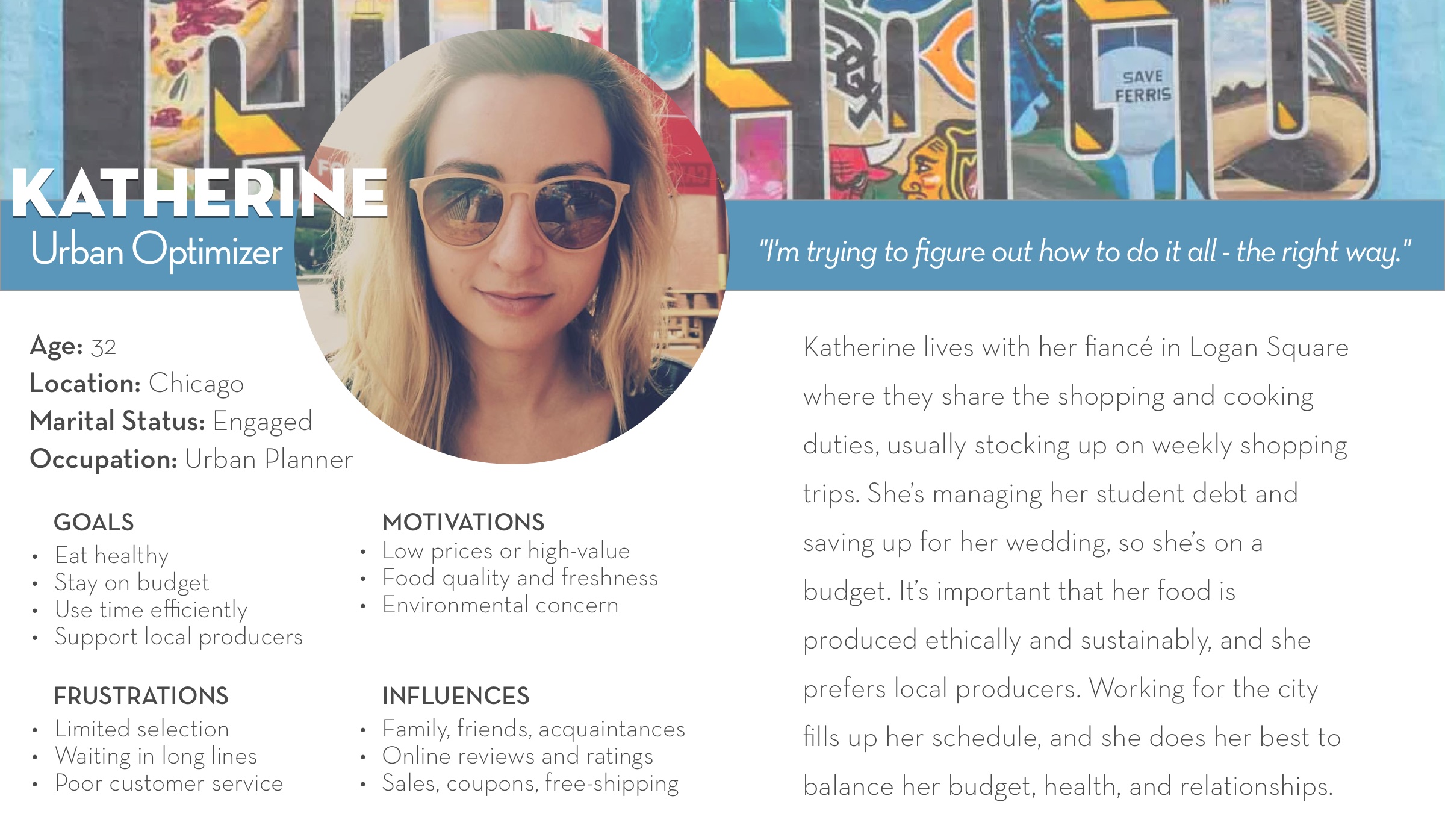
With a better understanding of the marketplace, I was ready to focus on better understanding the users. I synthesized six user interviews, highlighting common behaviors, motivations, influences, goals, and frustrations and then developed a primary persona based on them.
Persona
THE PROBLEM
After defining the primary user I’d be designing for, I developed a problem statement and user stories to clearly state the key problems I needed to consider while creating my design.
Problem Statement
The Urban Optimizer needs a way to quickly and easily find and buy well-priced and portioned, ethically-produced food from local producers because they want high quality and freshness while staying true to their values and balancing their budget and busy schedule.
User Stories
- As a busy urban professional, I want to quickly and easily be able to buy fresh food and produce so that I can accommodate my tight schedule.
- As a person with financial constraints, I want to be able to eat well at a good price so that I stay within my budget.
- As a socially-conscious citizen, I want to buy from local, authentic sustainable food producers so that I support the area-economy and the environment.
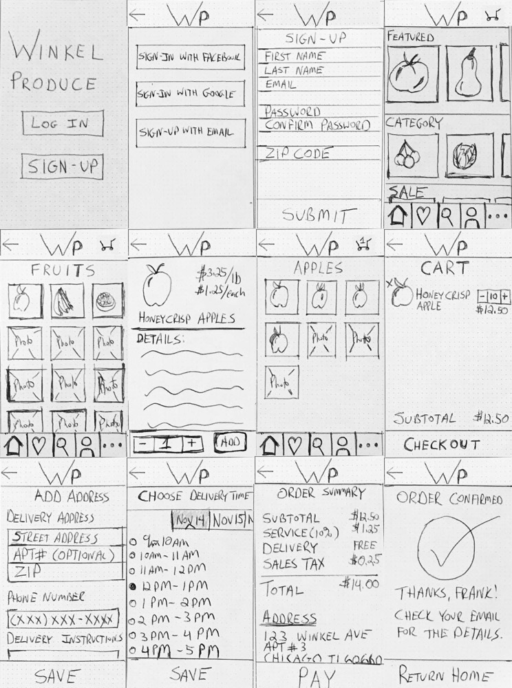
WIREFRAME SKETCHES AND PAPER PROTOTYPE
I did a series of rough 6-8-5 sketches to help generate ideas for possible solutions. This ultimately led to a paper prototype that you can see and interact with below.
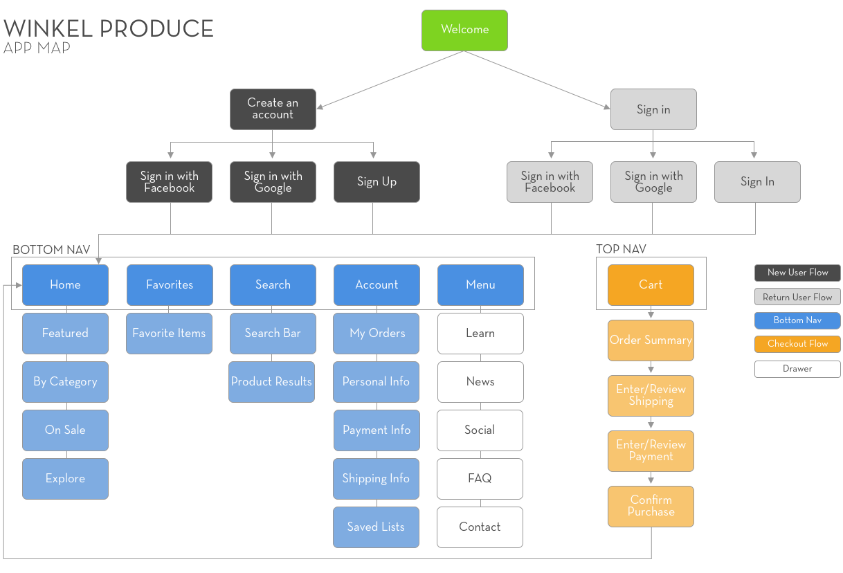
APP MAP
Laying out the information architecture helped me understand how the foundational pieces of the app would fit together. This greater structure was important to define and keep in mind while designing, since I wouldn’t be building the entire app.
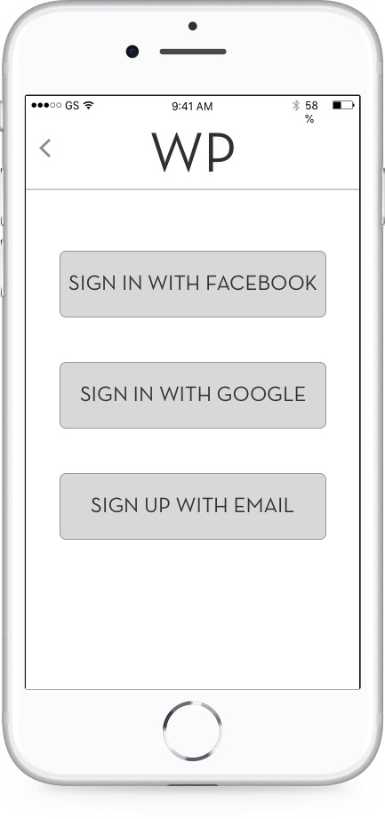
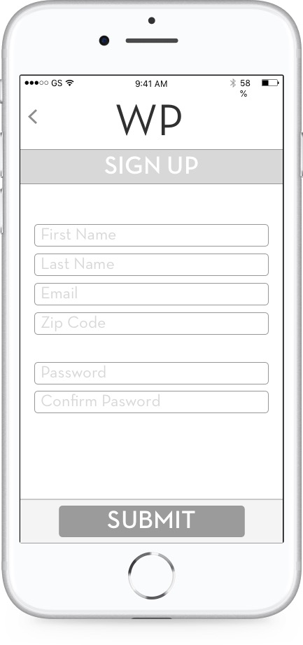
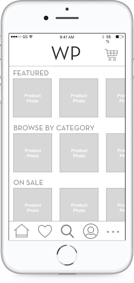
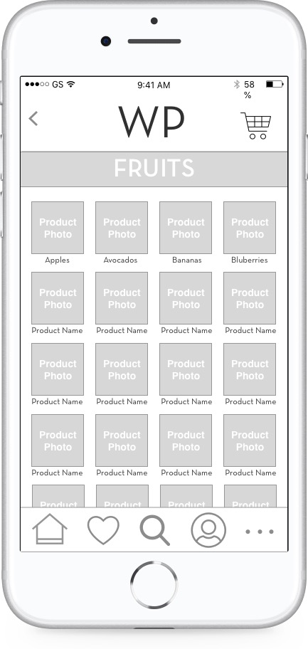
WIREFRAMES
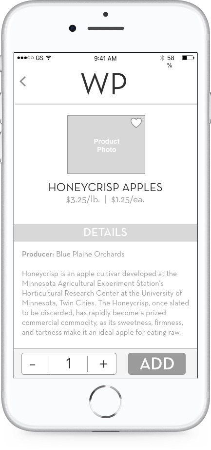
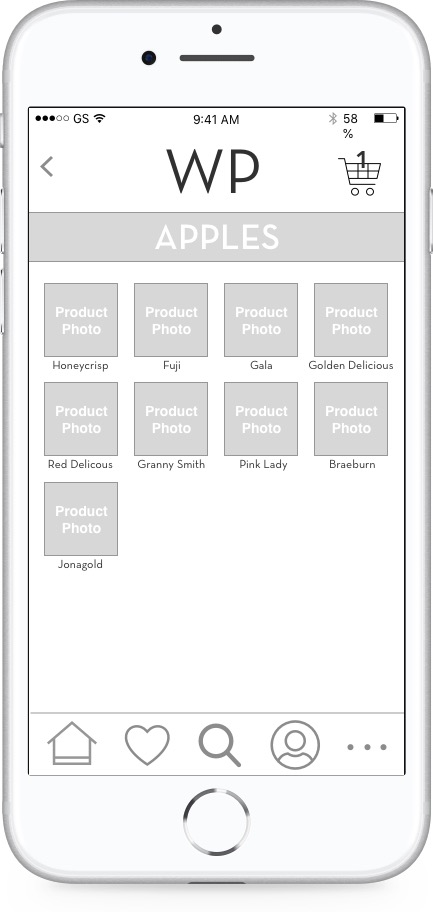
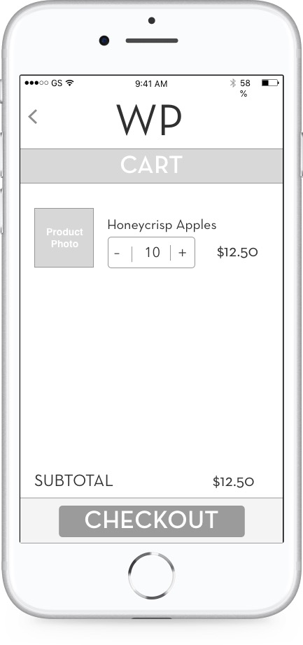
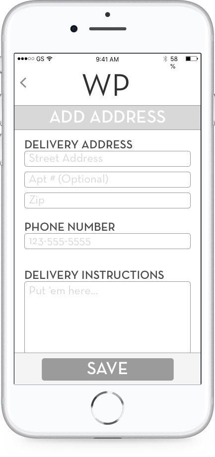
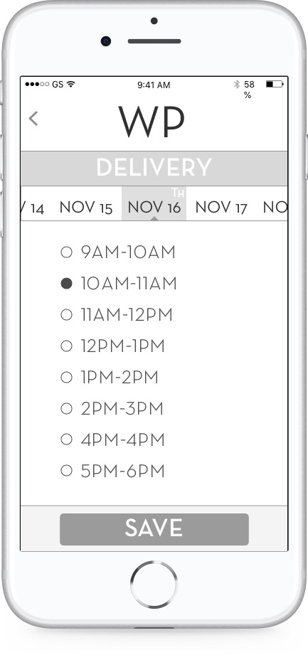
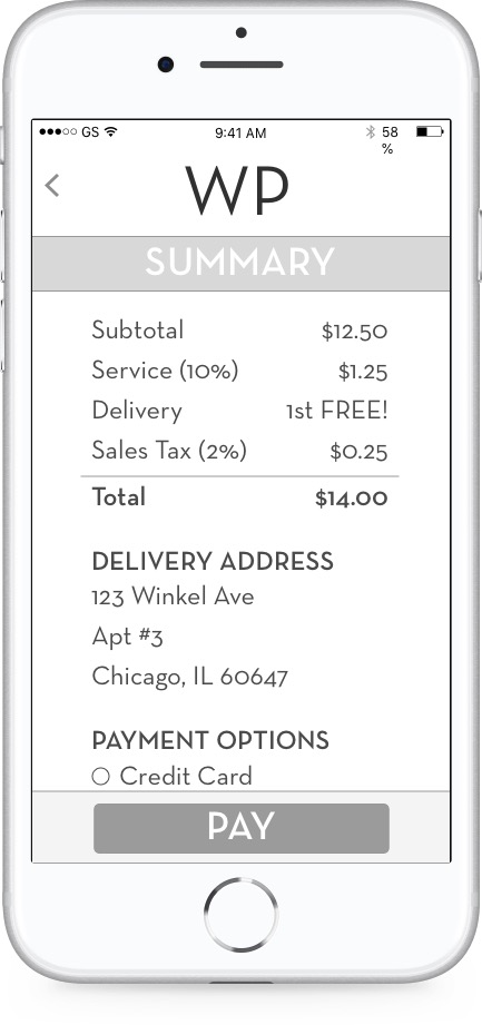
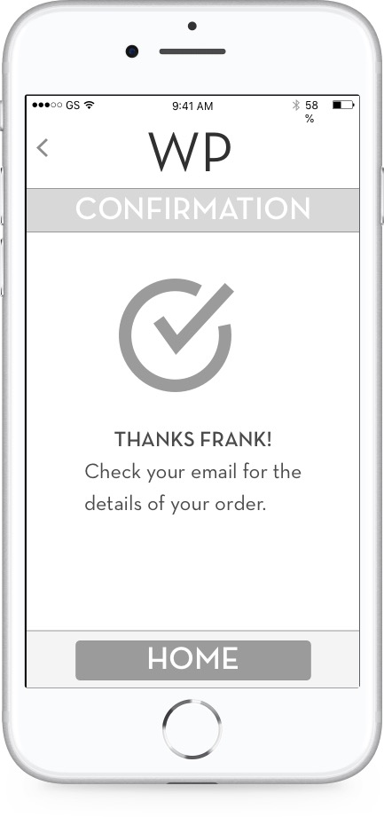
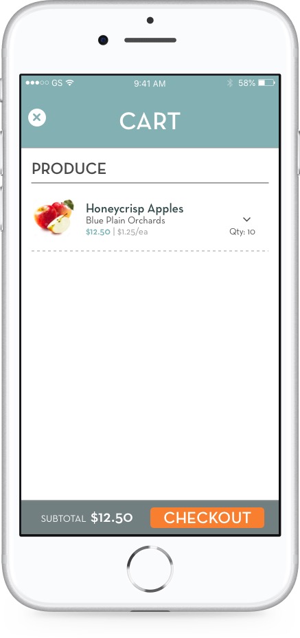
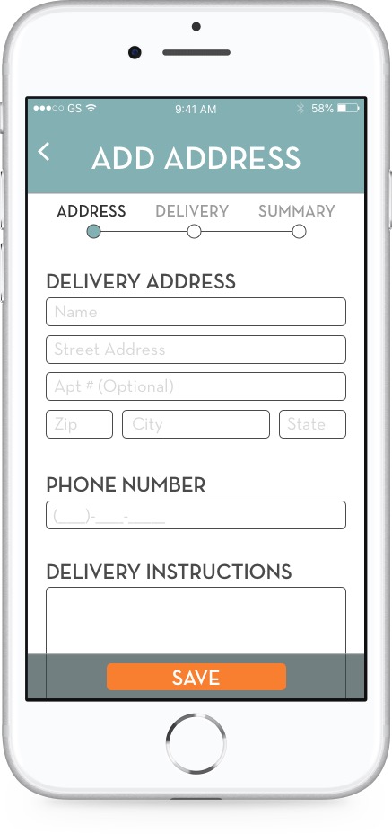
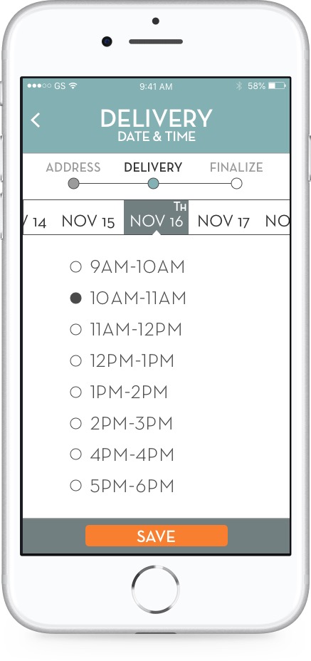
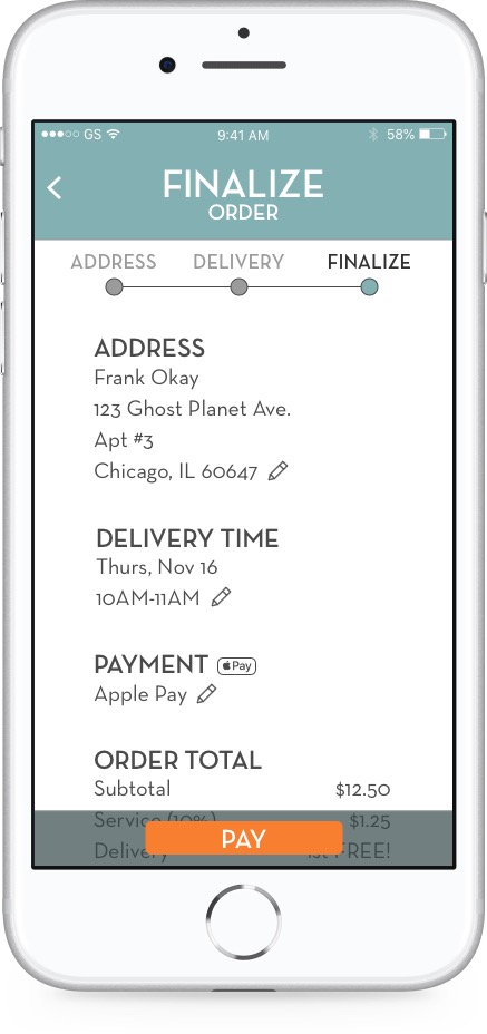
I designed a set of mid-fidelity wireframes focused on onboarding, the shopping experience, and the checkout flow.
UI DESIGN
Logo Concepts
I developed three logo concepts that balance clean, modern sans-serif type against earthy, organic imagery. I also created a new brand, Acre, which I thought would resonate more with Katherine.
Style Tiles
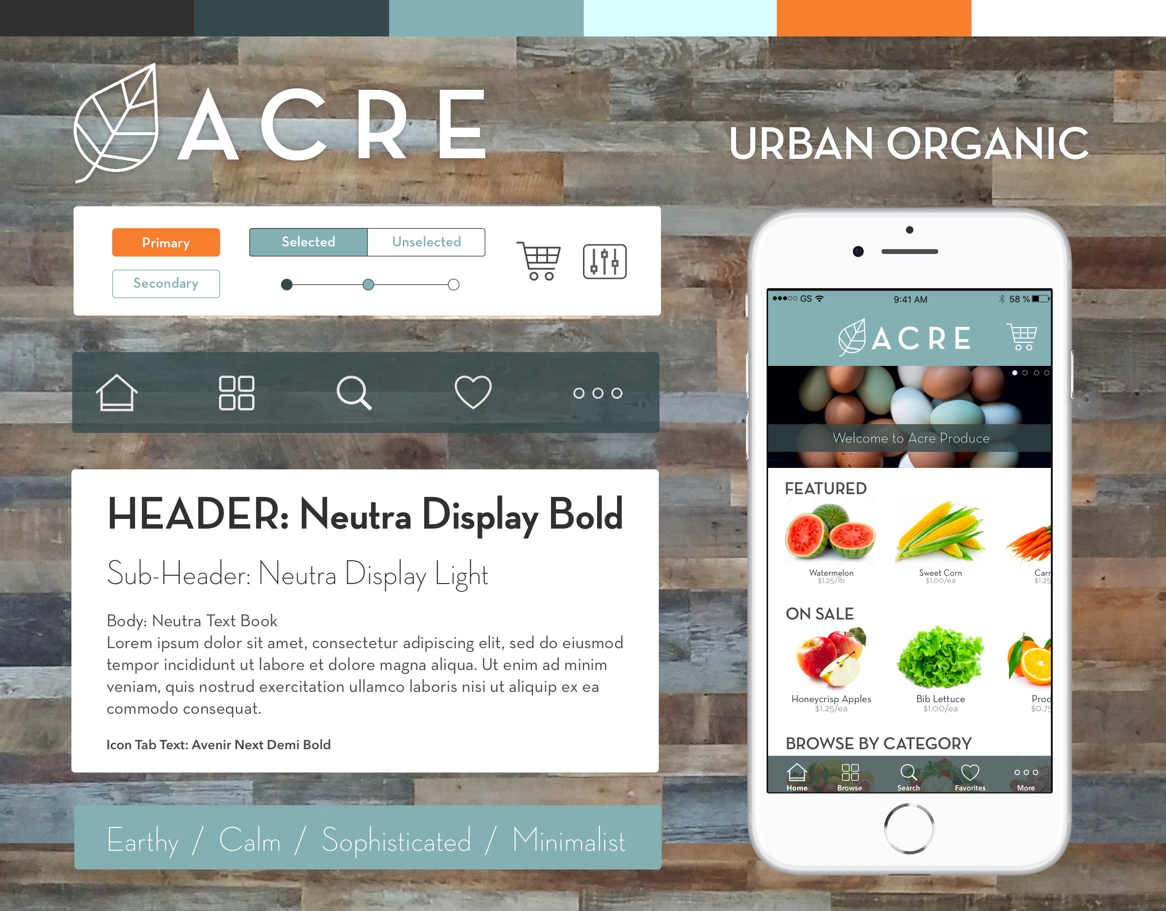
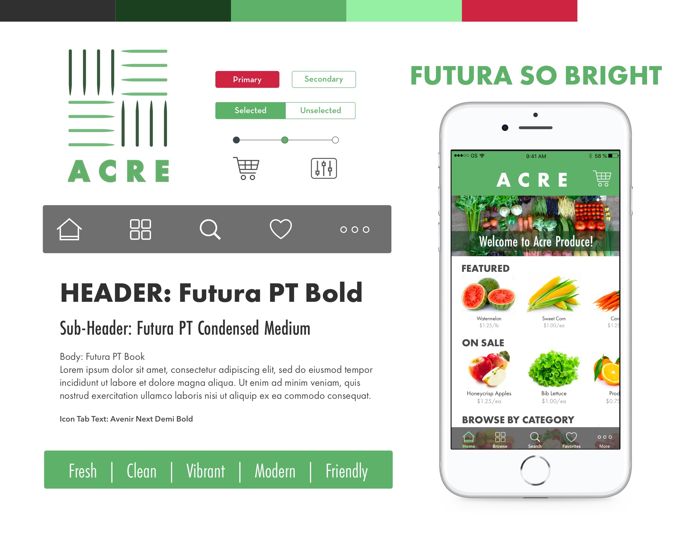
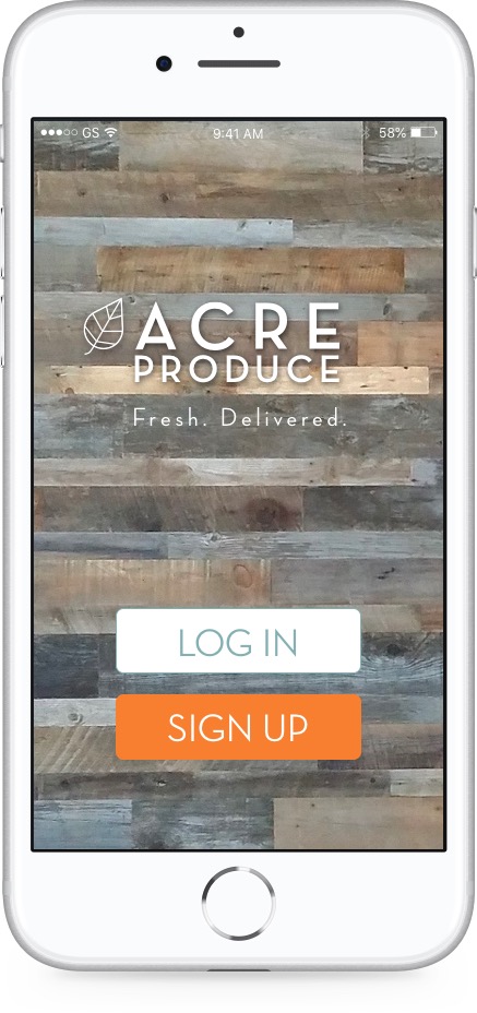
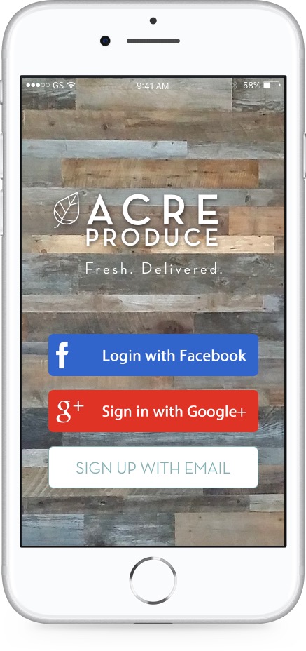
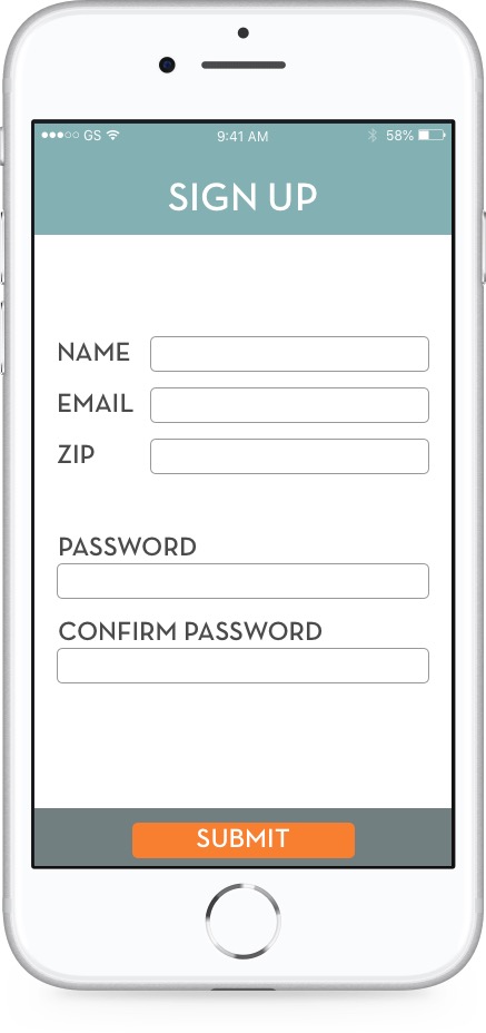
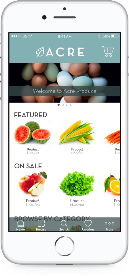
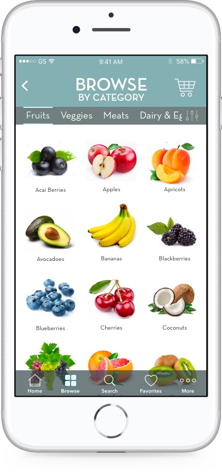
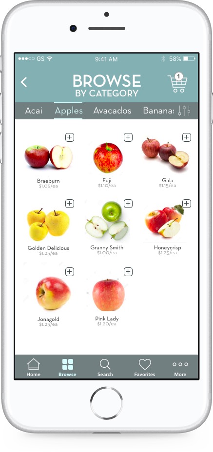
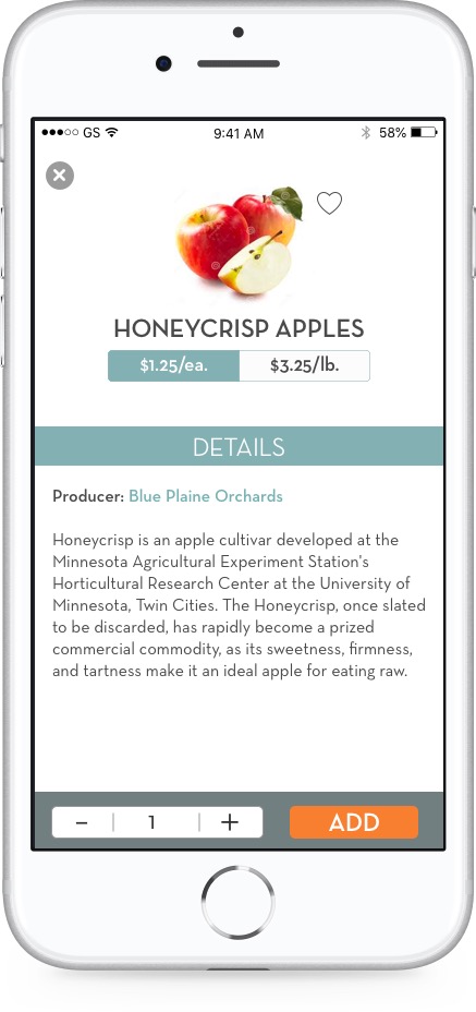
HI-FI SCREENS
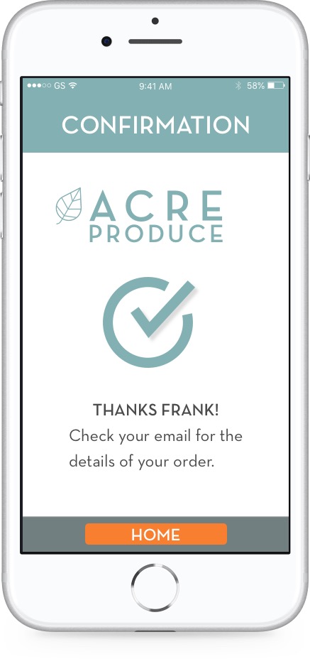
I took the Urban Organic concept and built high-fidelity mockups that I ultimately turned into a InVision Prototype that takes the user through an onboarding flow, searching for and buying a product, and a checkout flow.
Take a look at the InVision prototype.