
GuardianVets
A 3-week UX design sprint for GuardianVets, a veterinary telehealth startup based in Evanston
Team: 3-person UX team
Skills: UX design and strategy, interaction design, service design
Tools: Sketch, Axure
Working with GuardianVets was a new experience on a few dimensions. I had never worked with a startup, nor had I worked on a B2B product. As an added bonus, I looked forward to working with fellow animal lovers and learning more about a space that impacts my life as a dog owner.
PROJECT OVERVIEW
GuardianVets is a B2B veterinary telehealth startup that provides off-hours teletriage support to the clients of veterinary clinics. As founder and CEO John Dillon stated, “We take over the phones when a practice is closed and our team of DVMs and CVTs help clients understand whether their pet’s concerns are emergent.” The company developed an internal-facing system largely utilizing 3rd party software, launched in February 2017. The system allows the GuardianVets staff to take calls, collect pertinent details, and submit the information to the referring vet clinic via email.
Now having more than 50 clinic clients, GuardianVets was outgrowing their current proof-of-concept system. They asked our team to develop a tool to facilitate scaling by improving call efficiency, data quality, and reporting capabilities. In our initial conversation, the client suggested his top priority was to develop the clinic-facing segment of the system. He also indicated that the GuardianVets team and management-facing portions of the system were a high priority, as well.
Who we designed for
As we dove into our research, we had a handful of things we wanted to learn:
- The distinction between telemedicine services and teletriage
- Gaps in the triage or pet telehealth market
- The current GuardianVets experience for clinics and the internal team
- What information is most important to vet clinics
- What clinics and pet owners value most about the GuardianVets service
- Current product pain points
Identifying a few key points of focus, this frame felt like a good start. Of course, we knew we had to keep an eye out for emergent questions and themes as we gained an understanding of the challenges and business context in which GuardianVets operates. Since our team didn’t have previous knowledge of pet telehealth, our research started with an examination of the domain and competitive landscape.
DOMAIN RESEARCH
Foundational to all veterinary care is the concept of a veterinarian-client-patient relationship (VCPR). A VCPR is present when it meets the following requirements:
- The vet has assumed responsibility for making clinical judgments; the client has agreed to follow instructions.
- The vet has enough knowledge of the patient to make a preliminary diagnosis.
- The vet is available for follow-up.
- The vet provides oversight of treatment, compliance, and outcome.
- The vet maintains patient records. Exception: a veterinarian can give advice in an emergency situation.
Pet telehealth has two main segments:
- Telemedicine, which is client-facing, includes the delivery of information specific to a particular patient and is allowable only within the context of an established VCPR. An example of telemedicine is a veterinarian observing a pet under their care via video chat.
- Teletriage (or tele-advice) is a non-client-facing model that involves delivery of general advice, health information, or recommendation for future actions. This advice that is not intended to diagnose or treat, but to help make an assessment available options (i.e. whether a situation requires a trip to the ER or not).
Since GuardianVets doesn’t establish a VCPR with callers, the service falls into the teletriage space, meaning that the staff must stay clear of diagnosing, prognosing or treating patients. Any advice given should remain in general terms, not specific to an individual animal, diagnosis or treatment. Oriented within the world of pet telehealth, I next looked into competition in the market space.

My analysis showed that GuardianVets was the only competitor offering 24-hour support to clinics. To that end, GuardianVets was also the only competitor offering phone-based after-hours support to vets. The only other competitor offering after-hours support, Ask.vet, did so via a text-based platform. Our client suspected that GuardianVets was the lone competitor in this particular niche, and my analysis supported that suspicion, leading us to believe that they were well-positioned within the pet telehealth space as a high-touch service.
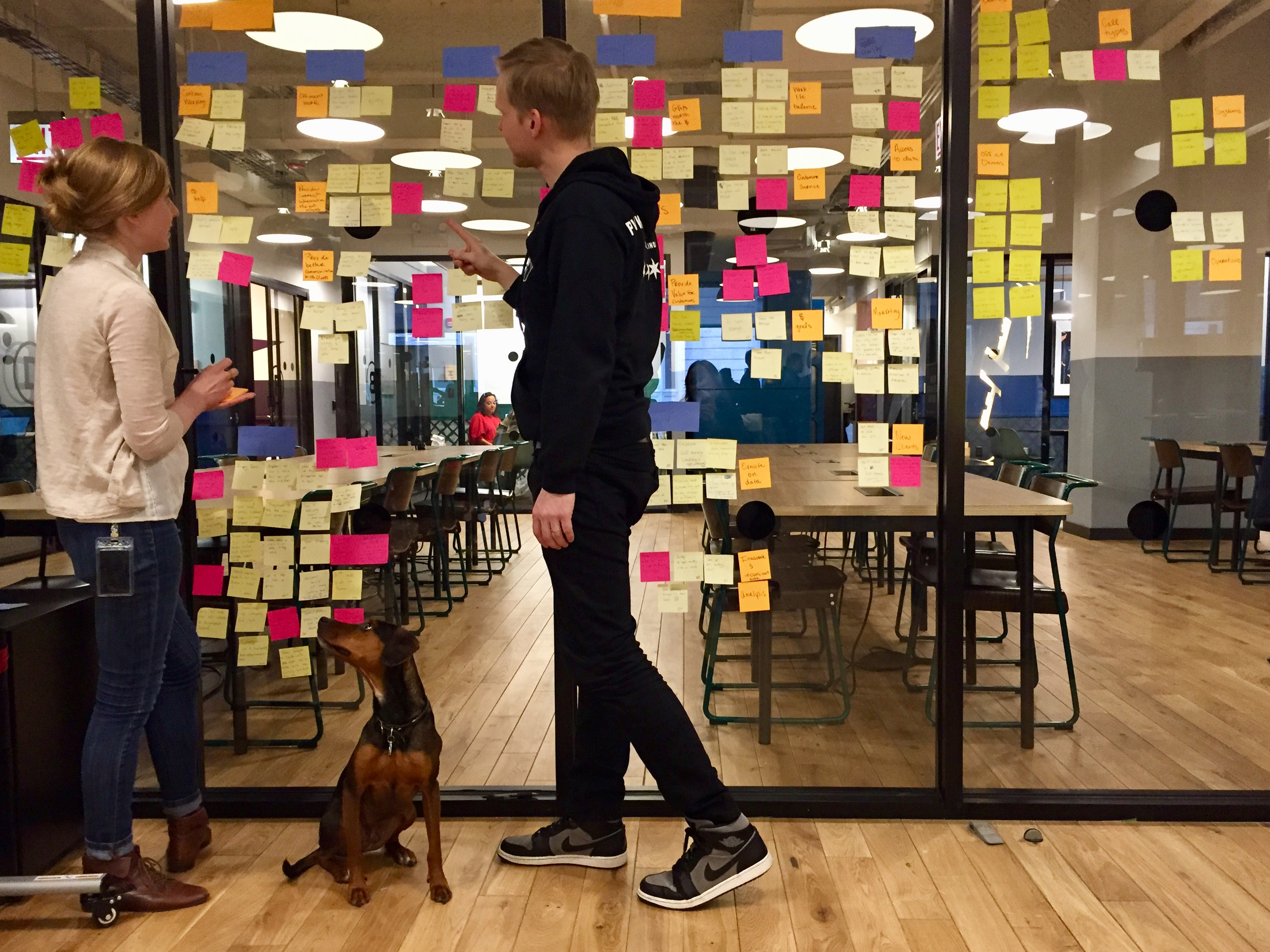
USER INTERVIEWS

With a better understanding of the competitive landscape, it was time to talk to some users. We spoke to nine and wanted to find out how the various stakeholders connected to each other through the product and service, as well as to understand what did or didn’t currently work.
WHAT WE HEARD FROM CLIENTS
Our interviews confirmed much of what our client had suggested—the vet clinics wanted more and better data to support operations and to better gauge the value of GuardianVets. They especially wanted a firmer grasp of the revenue generated by referred appointment and new clients. We found that when clients described what they valued most about the service, they all primarily focused on the customer service aspect—it gives the pet owners and veterinarians peace of mind off-hours. The clients often described pet owners as wanting another person to talk to as a sounding board during a difficult time. Since the marketing also focuses heavily on ROI, we found that the clinics measured the value of the service in terms of revenue.
Client Insights
“They're not out there alone, they have GuardianVets listening to them.”
-Cathy GuardianVets client and clinic administrator
“I wish there had been more of a breakdown to see how many were recommended to go to the ER and how many came to us for follow up appointments.”
-Robin, GuardianVets client and clinic administrator
“We know that we’re not getting the ROI we want... but it’s harder to quantify the value in terms of customer service and screening… The data isn’t obvious enough to make a compelling case.”
-Ben, GuardianVets client and clinic owner
WHAT WE HEARD FROM THE TEAM
The GuardianVets team appreciated the ability to work remotely in the veterinary field, and they were all invested in helping pet owners and providing excellent customer service. They echoed the clinics in suggesting that pet owners valued the person-to-person connection at what was often a stressful time.
The team highlighted issues with the current internal-facing platform that led to frustration, wasted time, and diminished data quality and detail. Most notably team members mention forms disappearing in the system when a new call comes in. If a form disappears, they have to call the referring hospital and go through the GuardianVets menu to trigger a new one. Also, after losing so many partially-completed forms, team members began handwriting notes and entering fewer details.
GuardianVets Team Insights
“Up until last September I worked in a private practice, but I had to quit due to heart issues. I stumbled upon GuardianVets… and I could work at home which was just wonderful.”
-Cathy, GuardianVets team member
“If I’m lucky I’ll fill out the form with a client, finish the call and hit submit, I just haven’t been doing this because I’m afraid some else will call and the form will disappear.”
-Jen, GuardianVets team member
“If I’m working on a form and a new call comes in, the new call supersedes the form and the form disappears. So I handwrite instead of using the form because it will usually disappear. Last night it took me four tries to get a form done.”
-Melodie, GuardianVets team member
DEFINING THE PROBLEM AND THE SCOPE


As the week unfolded and themes and insights began to emerge, our team decided that given the short project length, we needed to focus on either the clinic-facing or staff-facing experience. Our client had prioritized the clinic-facing part of the system, and at that time we thought that would be a more interesting challenge. As we conducted our interviews and learned more, we decided that the staff-facing part of the system presented a more critical, foundational, and actionable problem to solve. We created a problem statement to articulate the problem as we had come to understand it:
GuardianVets staff needs an efficient, but non-restrictive platform for consistent data entry which includes in-call access to client information, so calls can be completed immediately and accurately, leading to improved data quality and fostering continued growth.
To further help guide our design decisions, the team came up with four guidelines to focus our design decisions moving forward.
Given that GuardianVets’ immediate concern was scaling their operation, improvements to the efficiency of the internal call system would increase capacity without having to add staff. It also benefited clinics by enabling more timely and detailed call reports. Management benefited from a much more efficient centralized review process, a task currently handled by one person. We had to make sure our solution prioritized critical information, featured efficient forms that were persistent and easy to learn, and promoted naturalistic interactions between pet owners and the GuardianVets team.
We presented our findings and proposed scope to our client in our next meeting. Knowing that he had prioritized a different part of the site, we prepared to make our case. As expected, the client felt hesitant about the shift in focus, but as the discussion continued, he ultimately suggested that our conversation had caused him to consider his business from a new perspective. Aligned with our client on the focus of the problem, we moved on to generating ideas for solutions.
POTENTIAL SOLUTIONS
With our problem, design guidelines, and insight in mind, we brainstormed ideas on what needed be the critical elements of the system for us to test. As a team, we identified these areas of focus:
- Reformatting and streamlining the existing form
- Persistent forms with pre-populated info (e.g., vet practice name, caller ID)
- Presenting relevant clinic details in a form (e.g., on-call schedule, hours)
- In-system review of completed forms
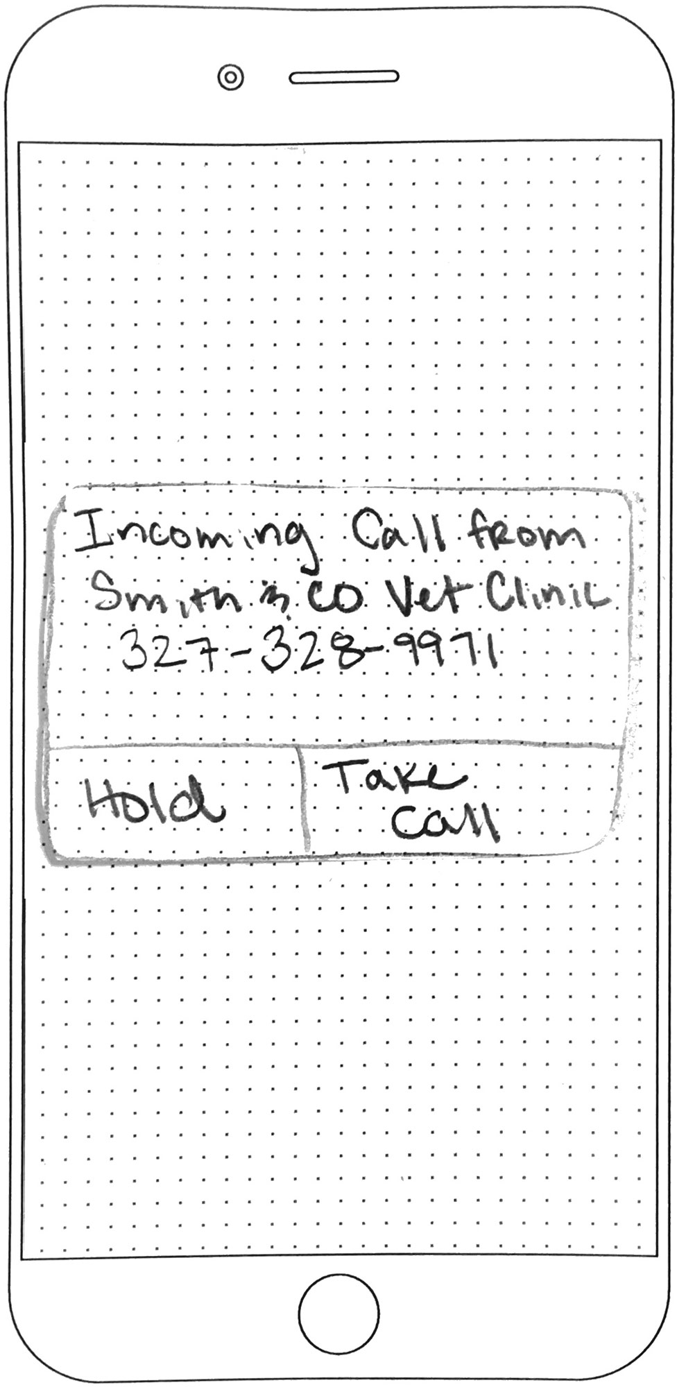
- Taking calls on the cell vs the computer

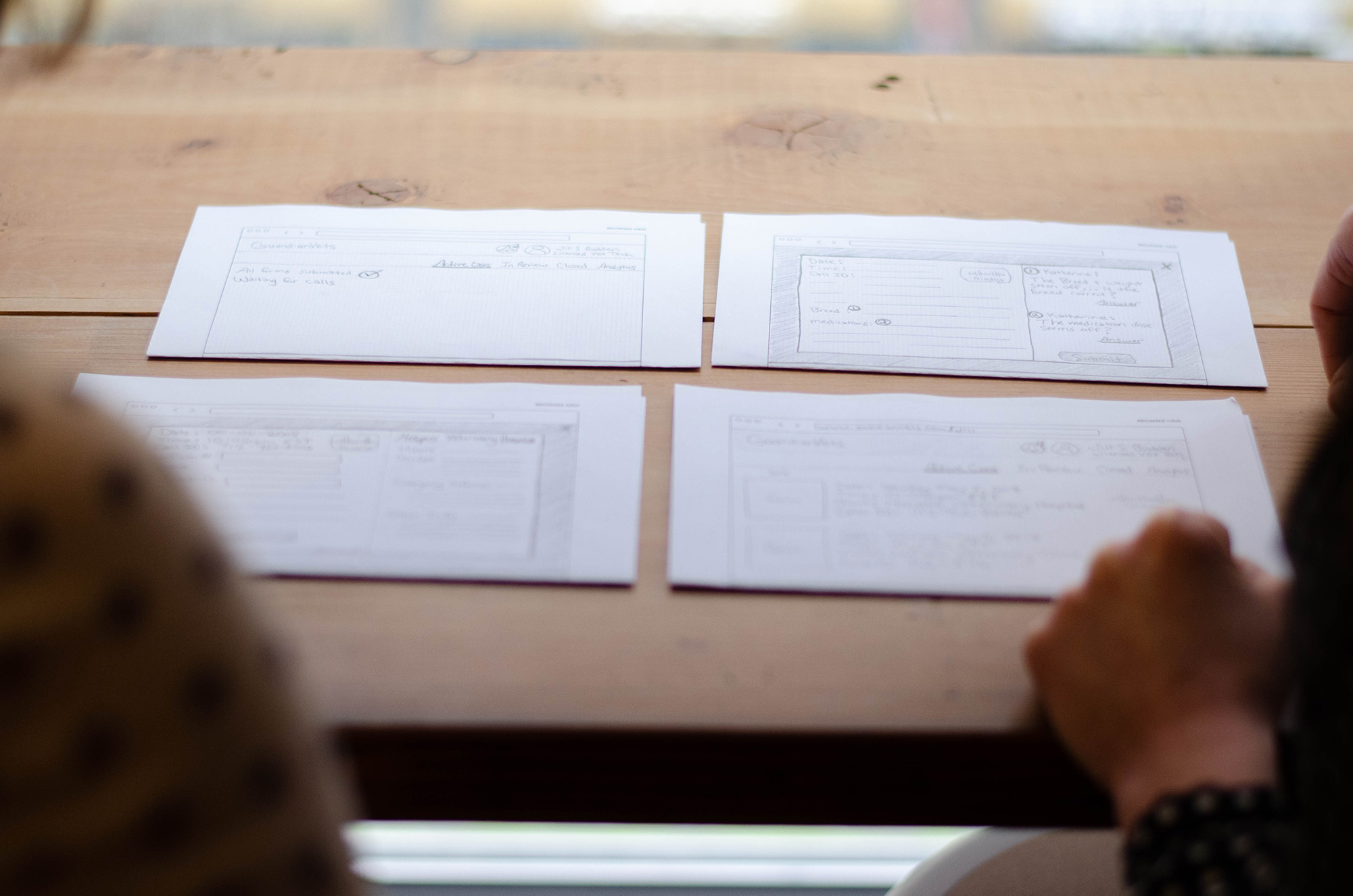
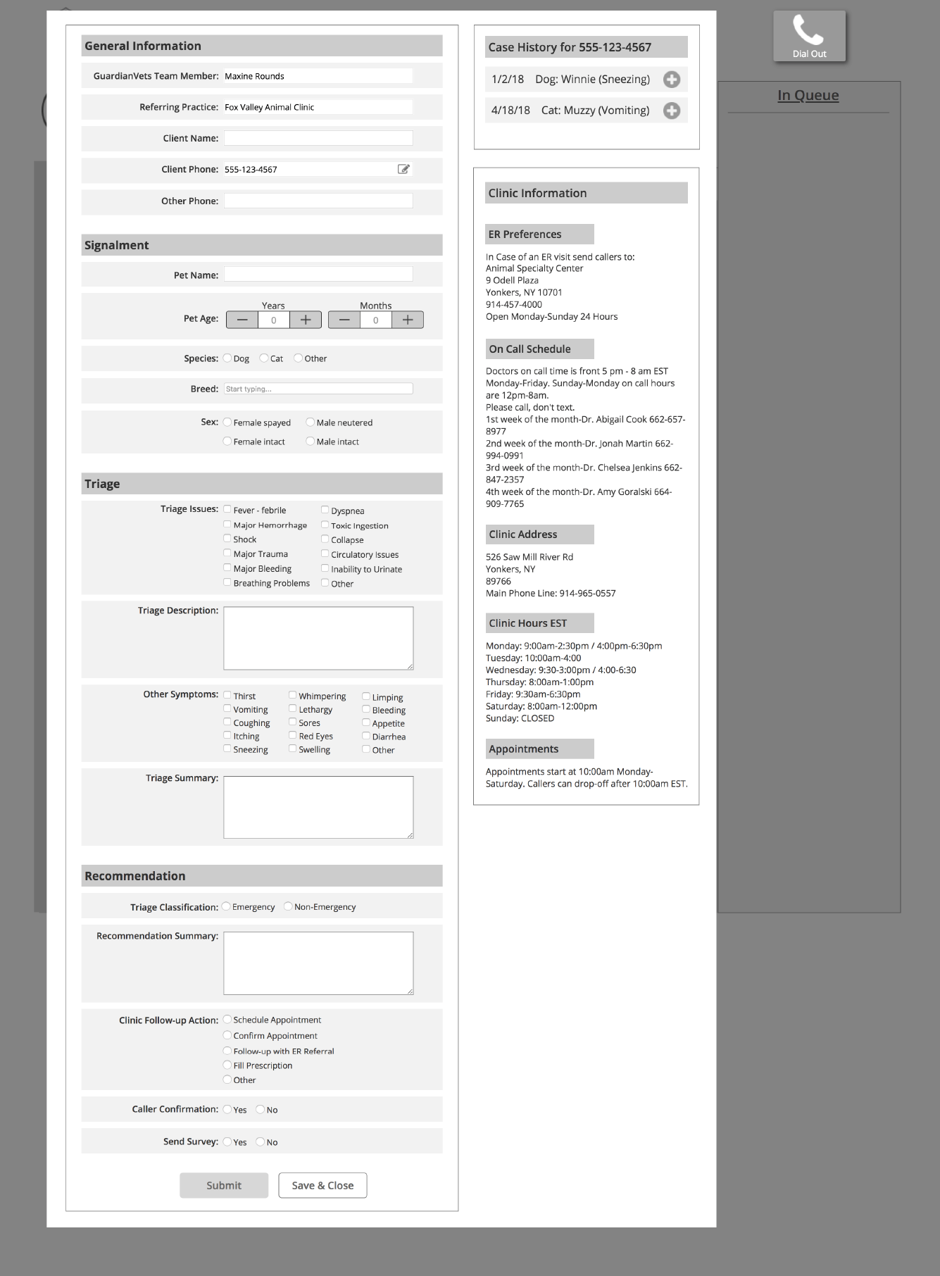
Concept 1: Streamlined Input Form
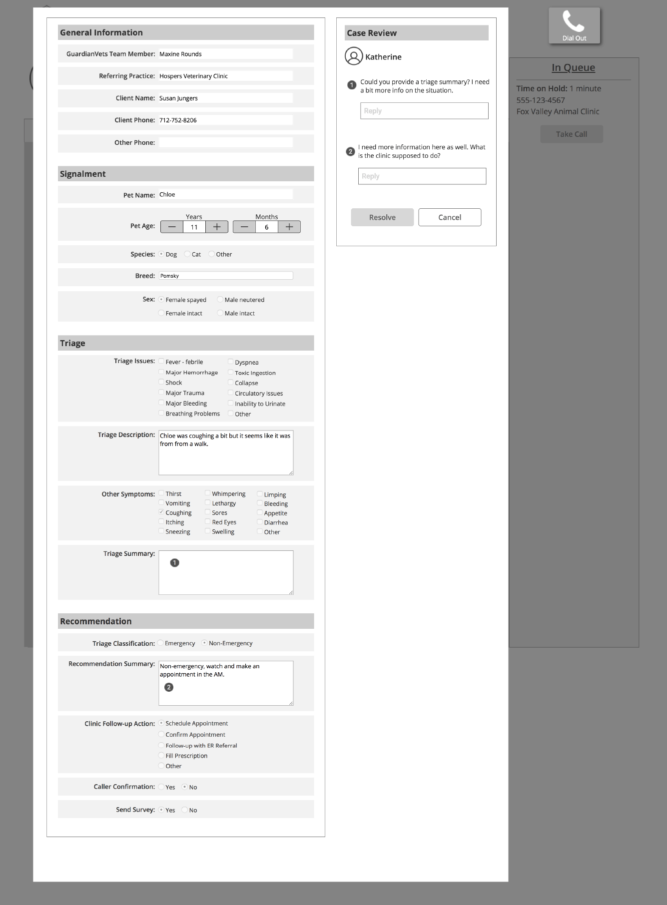
Design considerations: form layout, input efficiency, learnability, form content
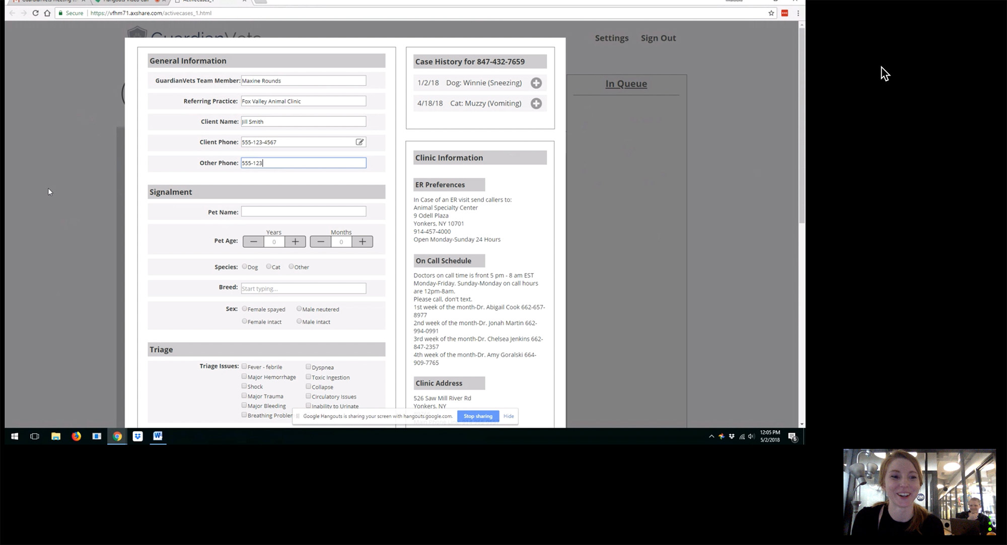
We heard the intake form had significant structural flaws which slowed down the staff when they filled out a form and led to a tremendous amount of frustration and wasted time. I evaluated the existing form and built an updated version directly in Axure, adjusting layout and inputs to increase efficiency and learnability. Specifically, I focused on breaking the form into digestible sections, labelling inputs clearly, and eliminating dropdowns in favor of radio buttons and predictive searches. I left the content of the form largely intact, making only a few small tweaks. We wanted to get a clearer sense of user pain points as they interacted with the form while on a call, as well as their reactions to the initial structural changes to the form.
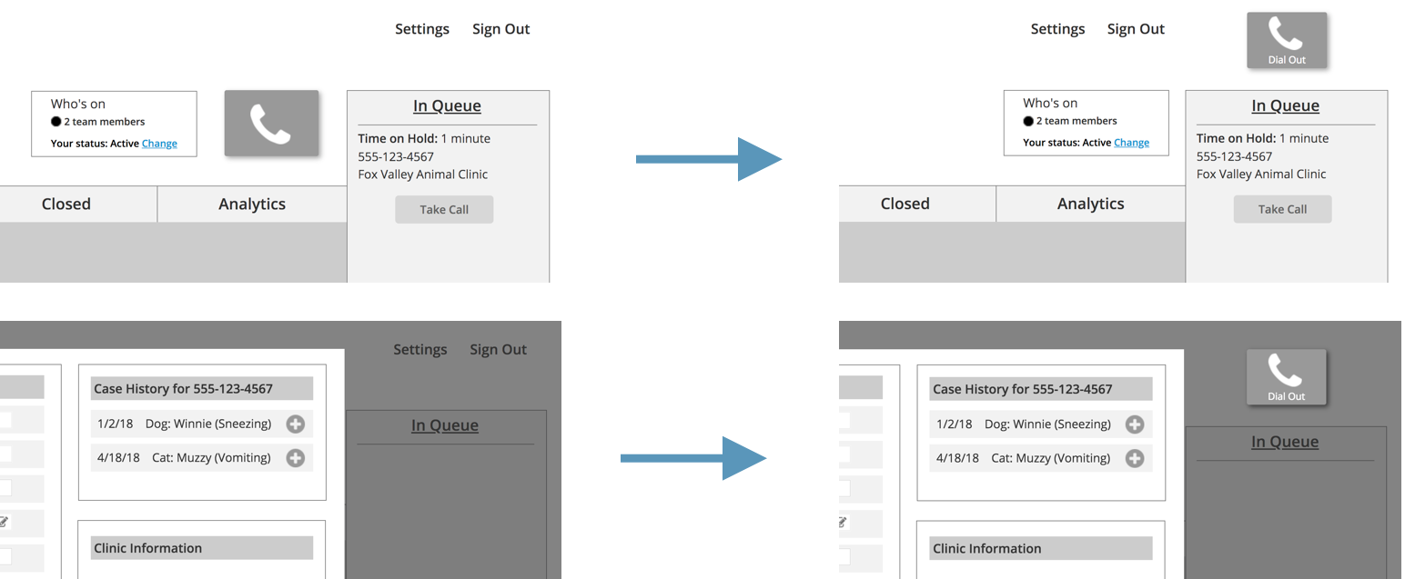
Concept 2: Desktop to Mobile
Design considerations: dashboard view, call waiting, vet clinic info, mobile view
The Desktop to Mobile concept explored user dashboards, displaying clinic information in the context of an intake form, as well as a mobile interface. We wanted to know if a dashboard view would be desirable for the users, and if so, what information would be most useful. We also wanted to determine whether the clinic information being shown in context with the form clearly displayed the necessary information. Finally, we wanted to hear users’ thoughts on developing a mobile platform for handling calls.
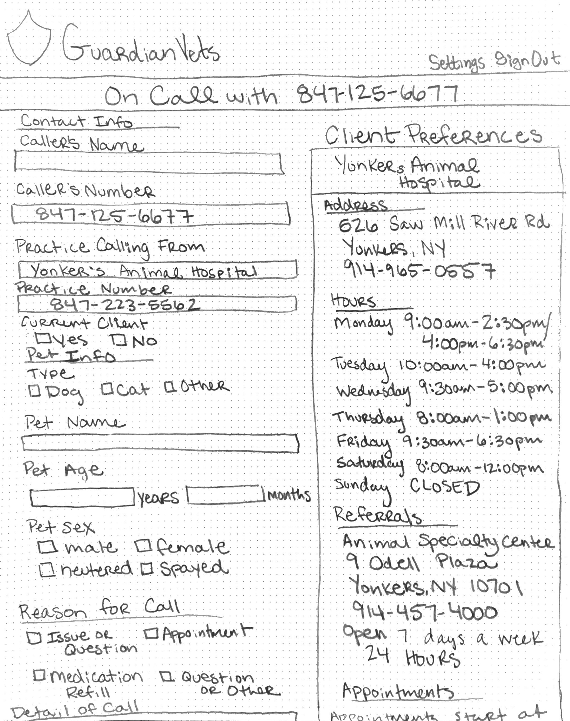
Users loved seeing the clinic info in the context of the form, but they noted it should include a few additional fields, such as pricing and clinic protocols.
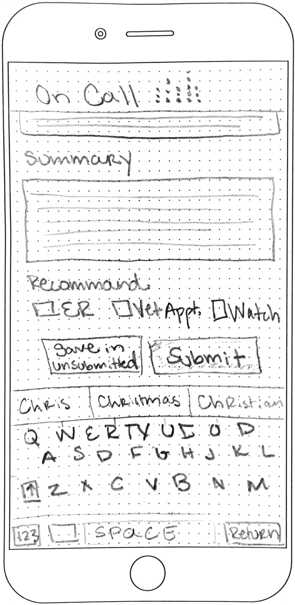
Concept 3: Finalize Form
Design considerations: pre-populated information, notifications, persistent forms, in-application reviews
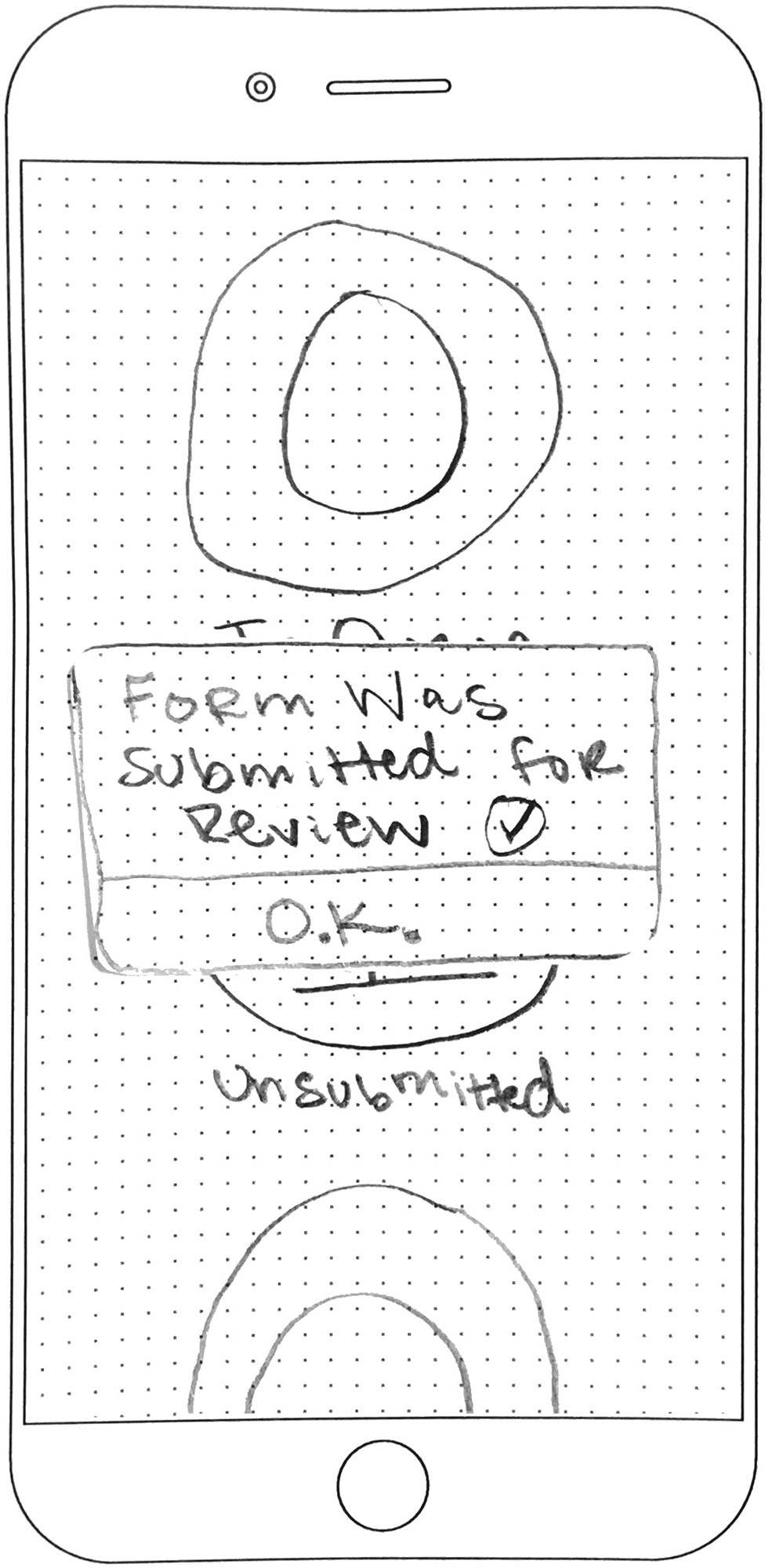
The Finalize Form concept explored the idea of a staff member opening an in-process form, completing it, and submitting it. The concept also introduces an in-application review process. We wanted to know if the users understood the workflow and found the in-system review functionality desirable.
CONCEPTS TO PROTOTYPE
After discussing the results of the concept testing with our client, the team felt the best direction forward involved combining aspects of each prototype, prioritizing the features that were essential to ensuring efficient call handling.
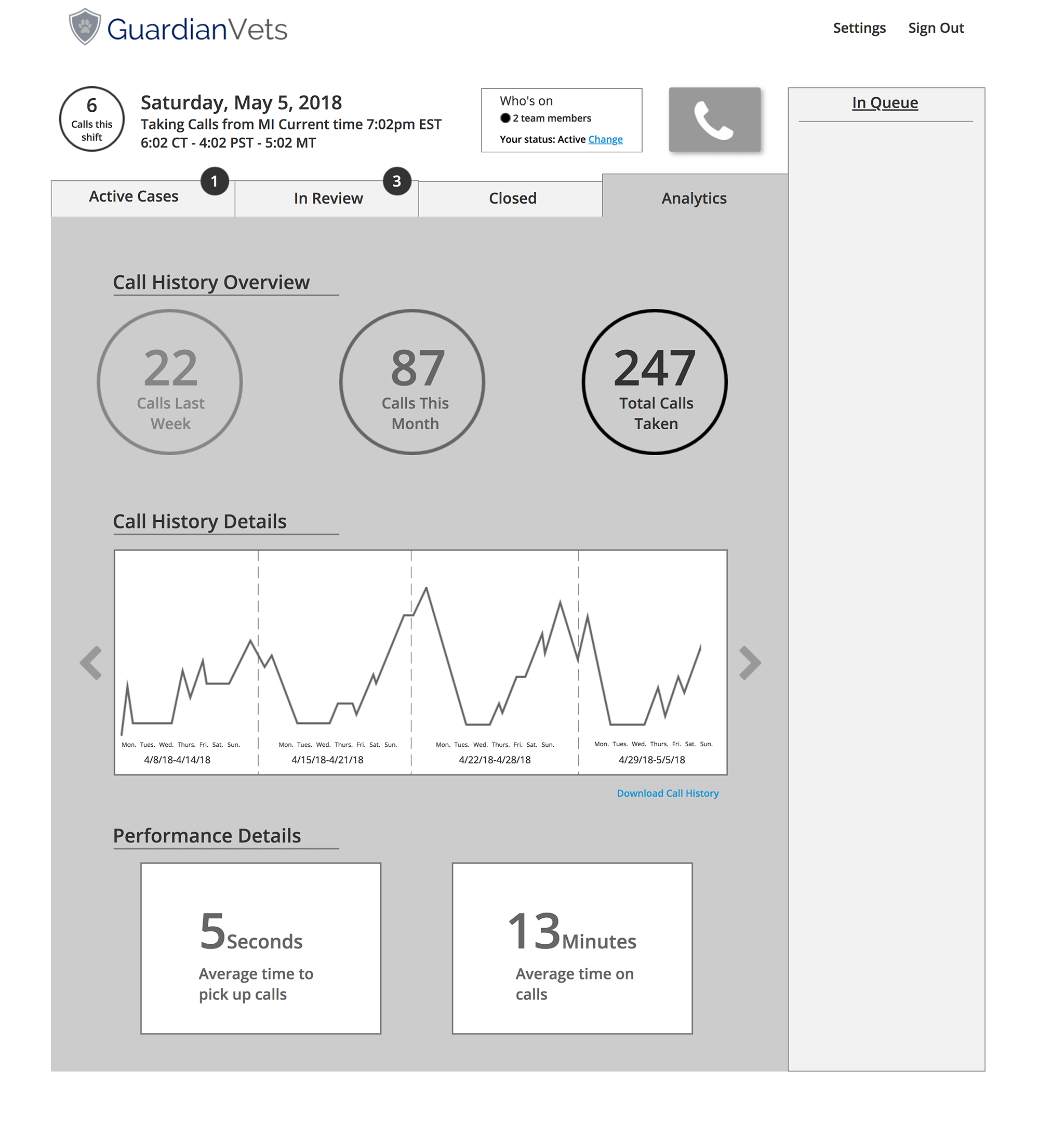
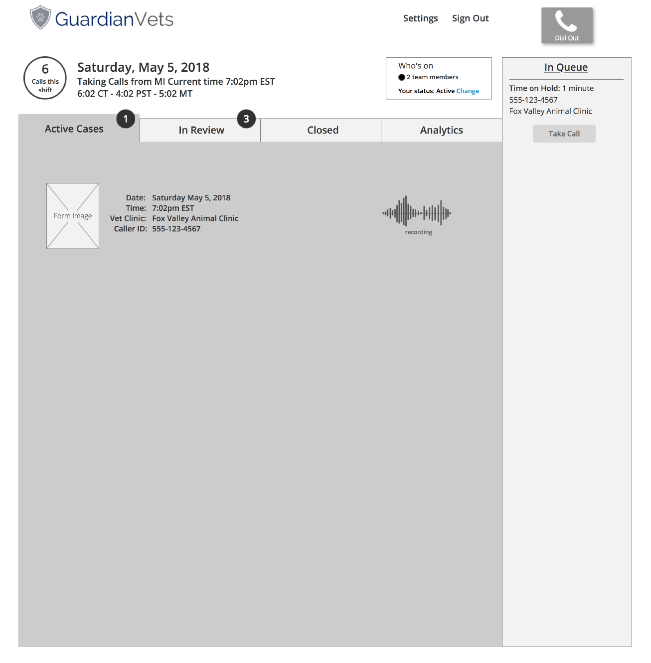
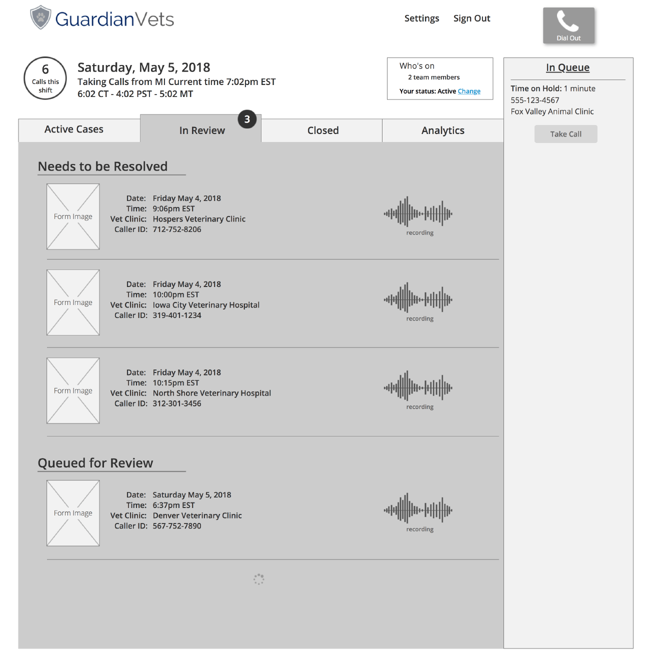
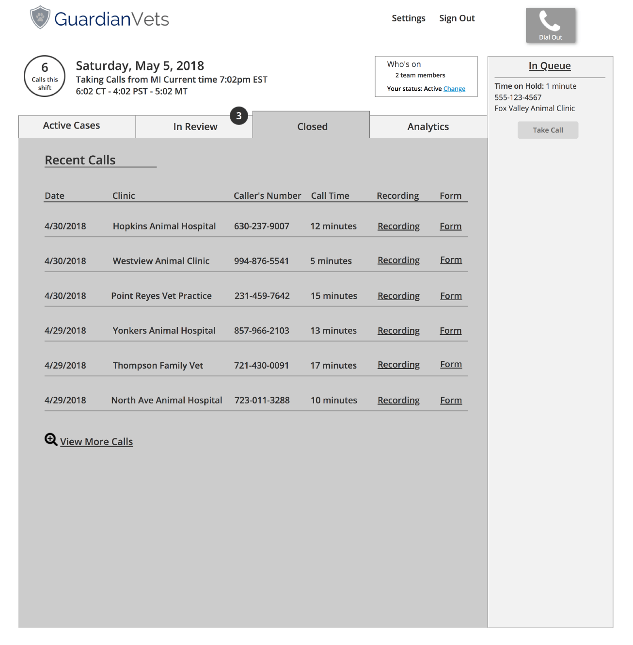
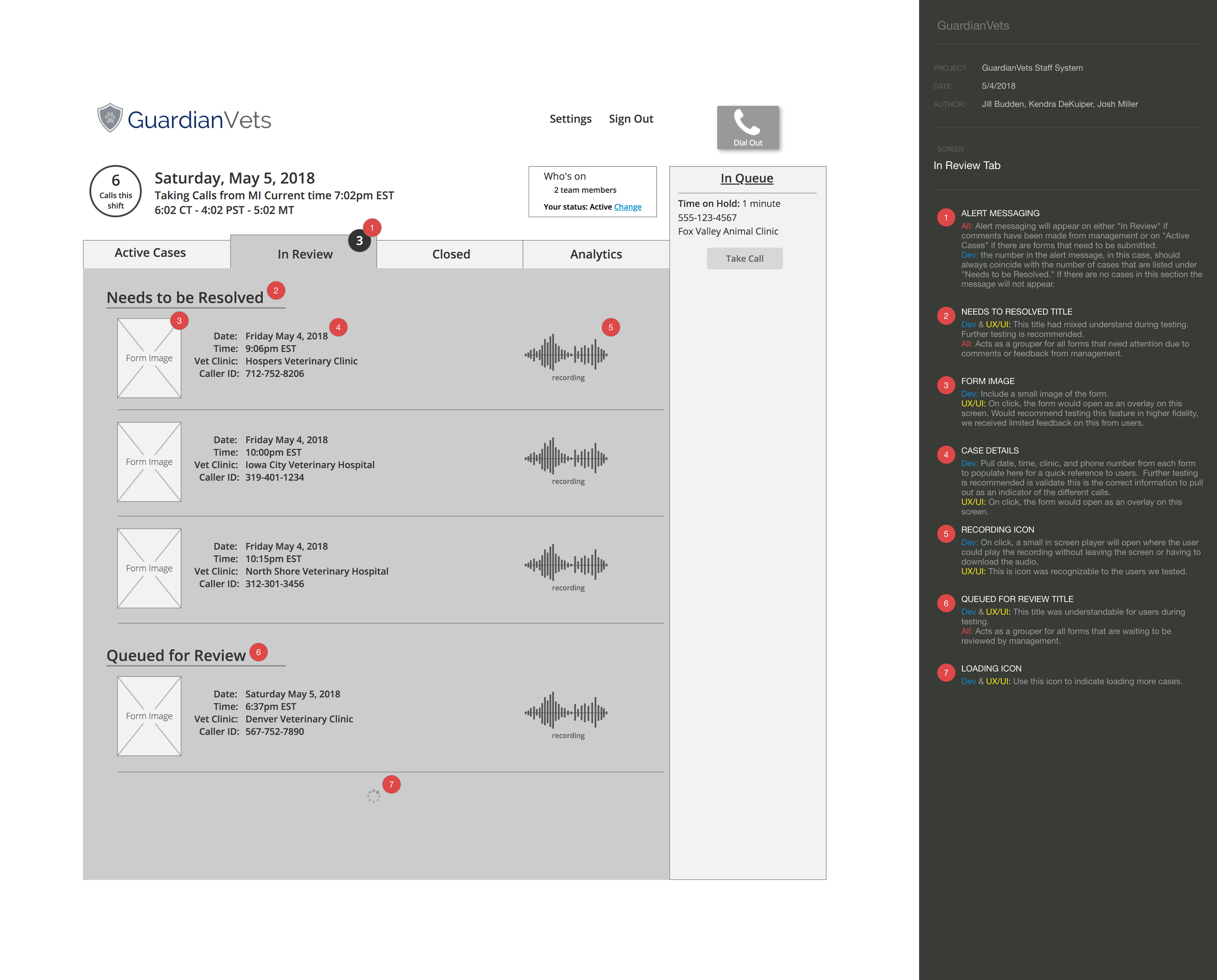
To handle calls and complete forms efficiently, our prototype featured a clear and actionable home screen, streamlined decision support form, and call queue that is always visible. We included an in-system case review and a history of closed calls to provide transparency and ease administrative burden. We also wanted to continue to explore the concept of a user-focused analytics dashboard as a means to both inform the staff of their own performance and provide management a way to communicate key performance metrics.
-
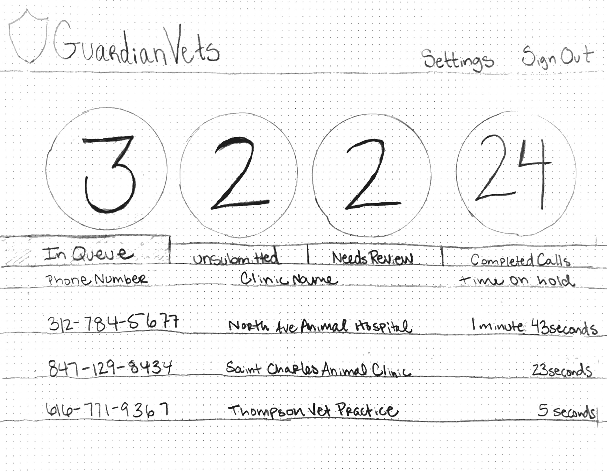
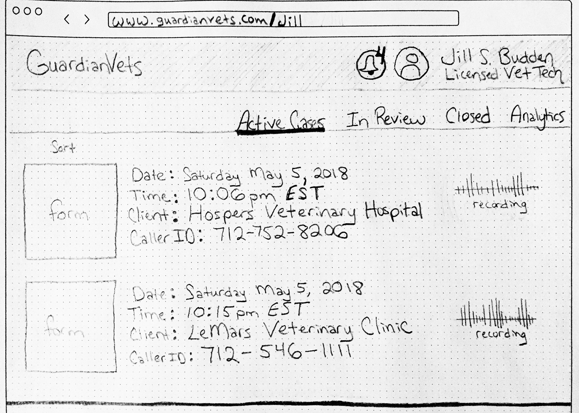
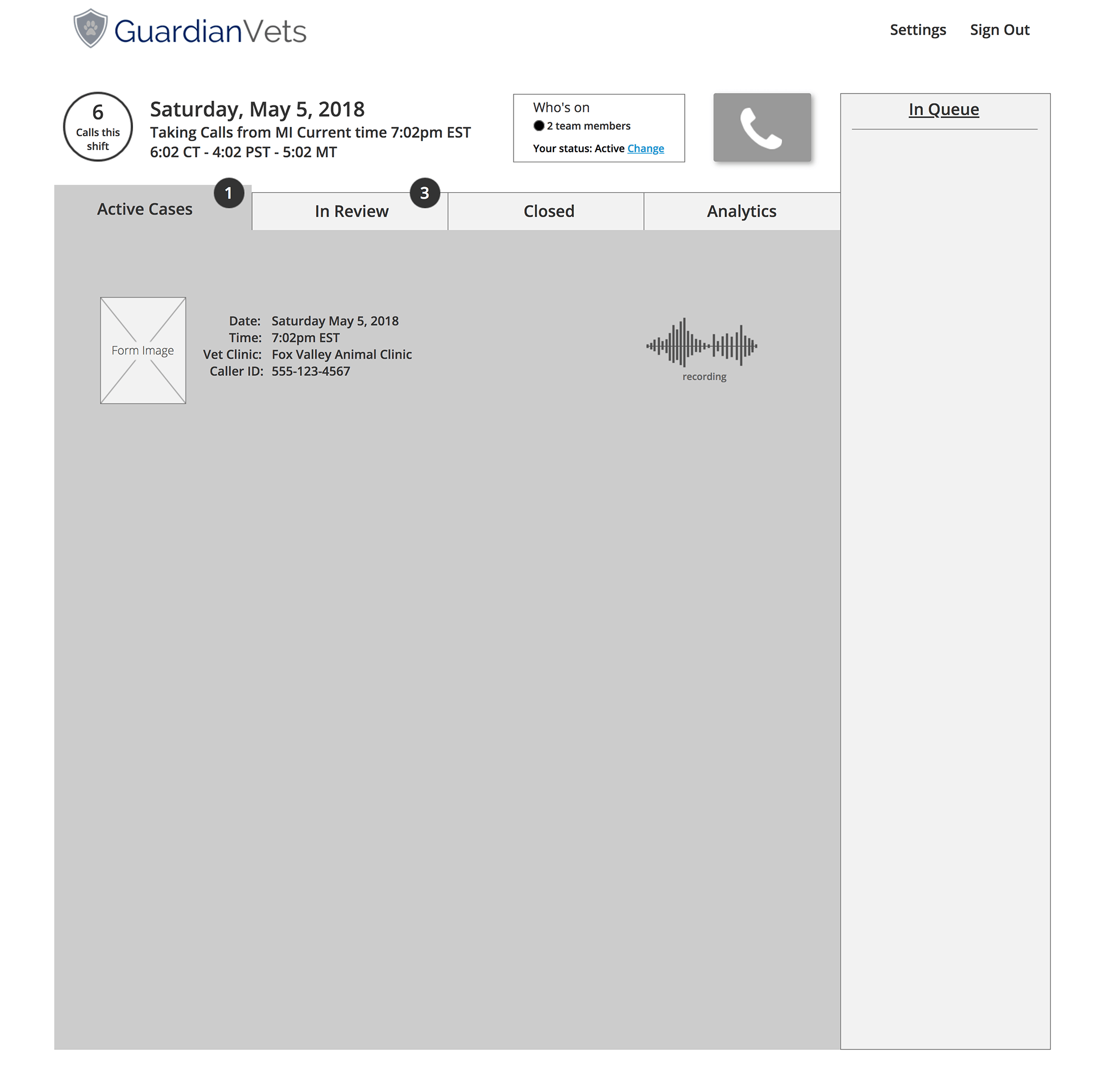
Active Cases Tab
![]()
-
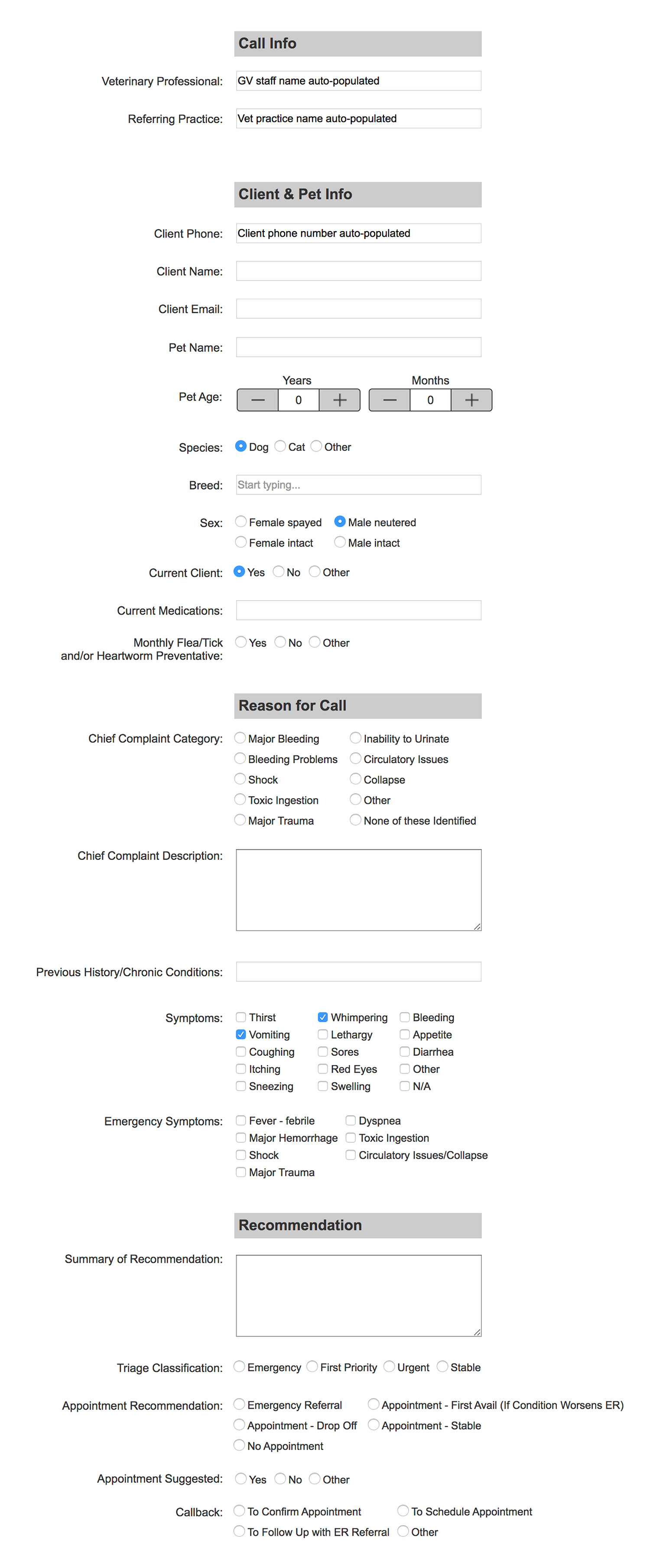
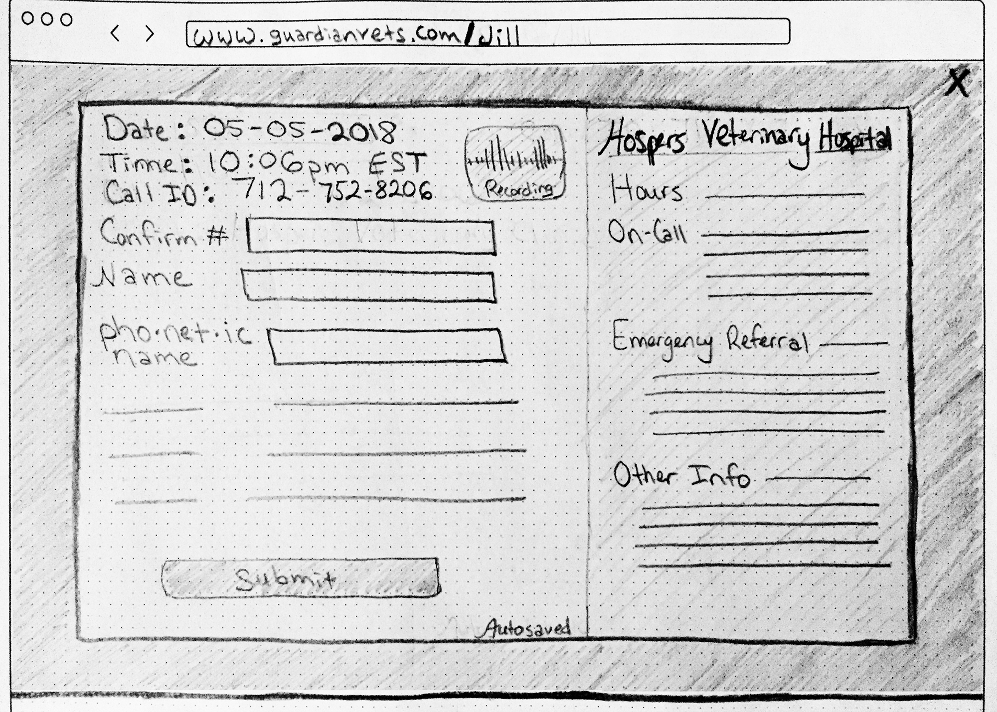
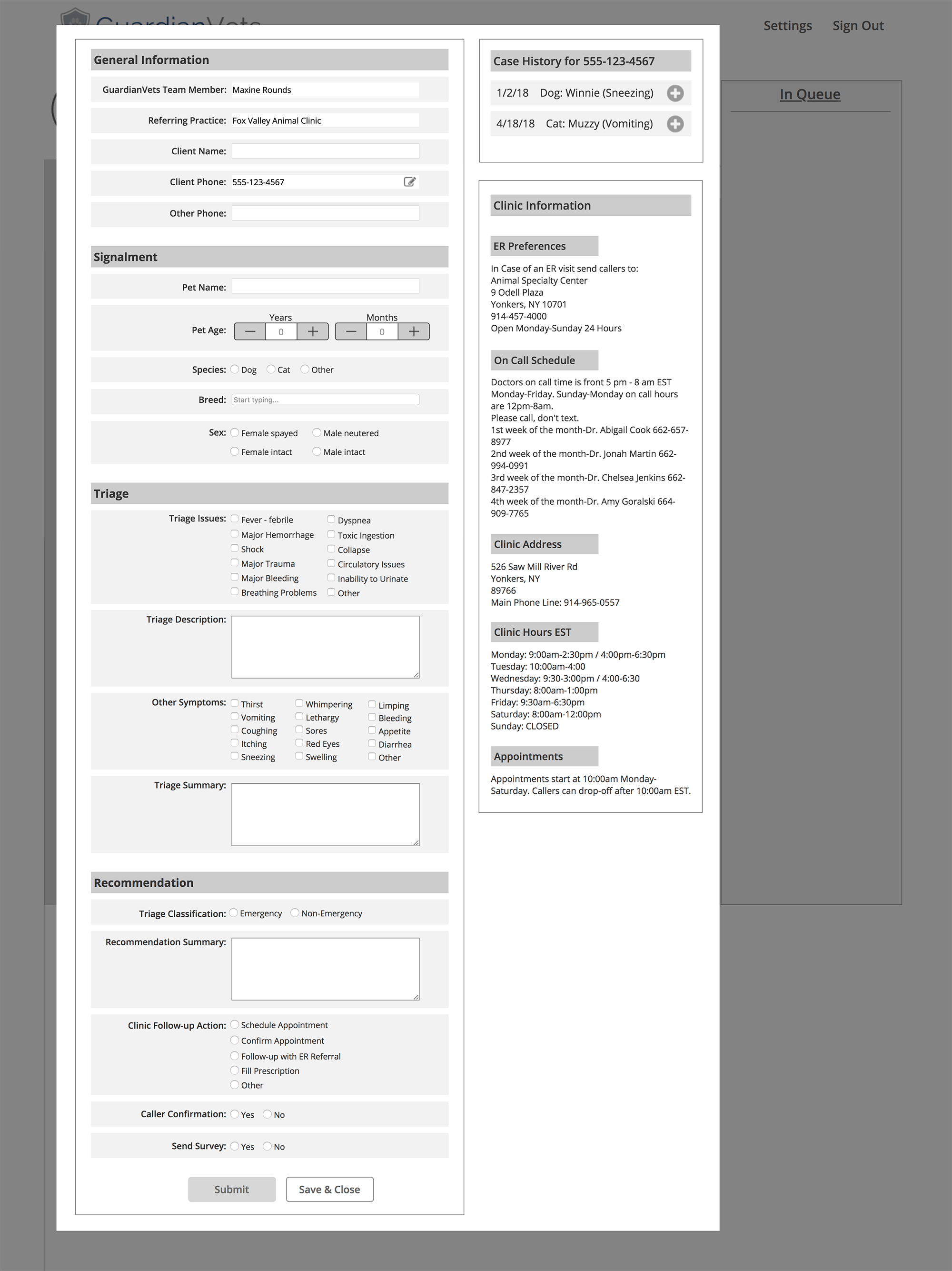
Decision Support Form
![]()
-
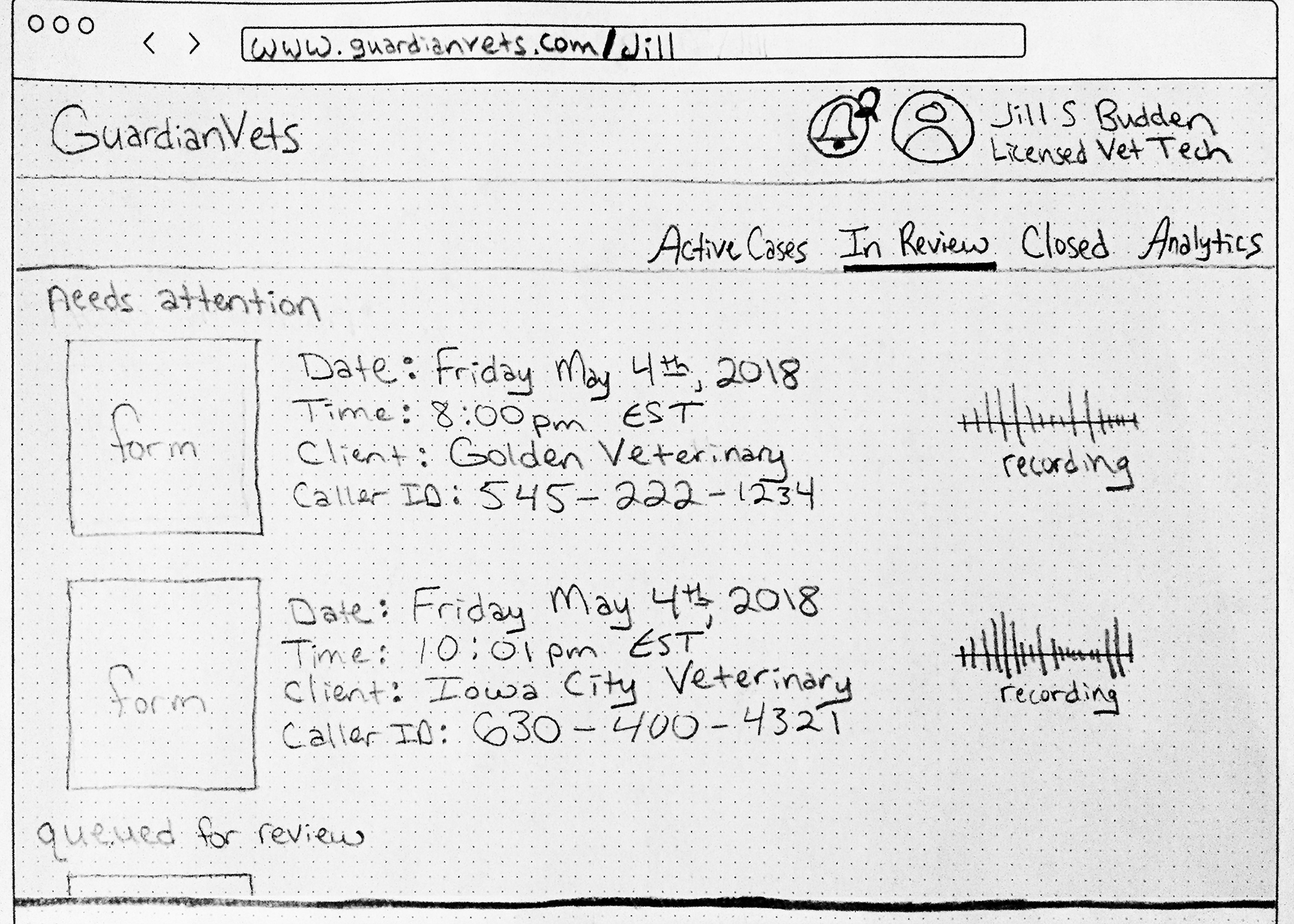
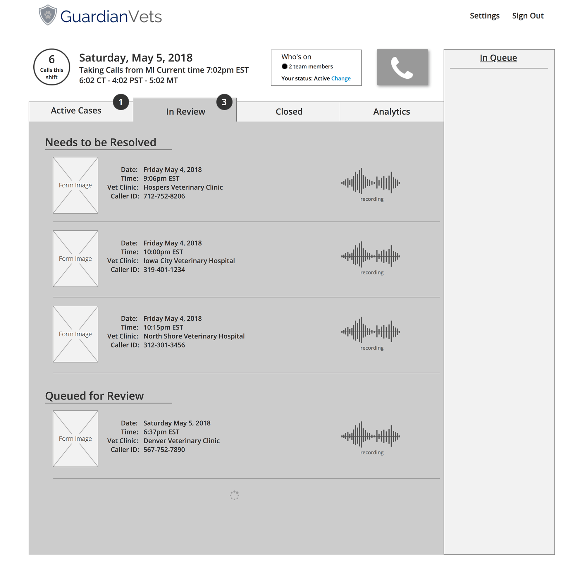
In Review Tab
![]()
-
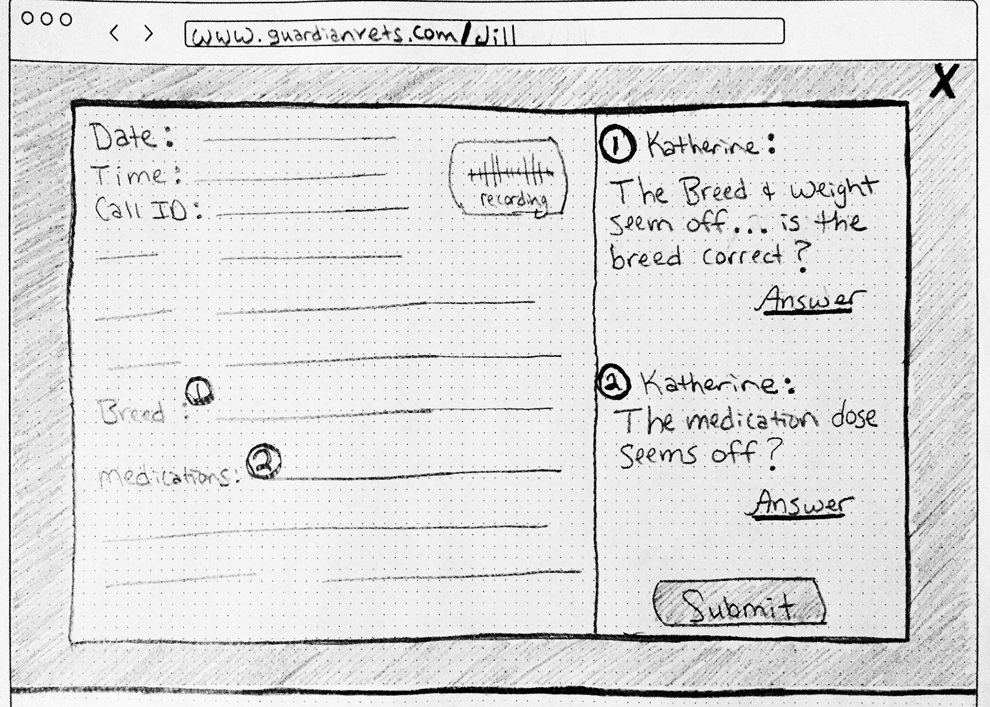
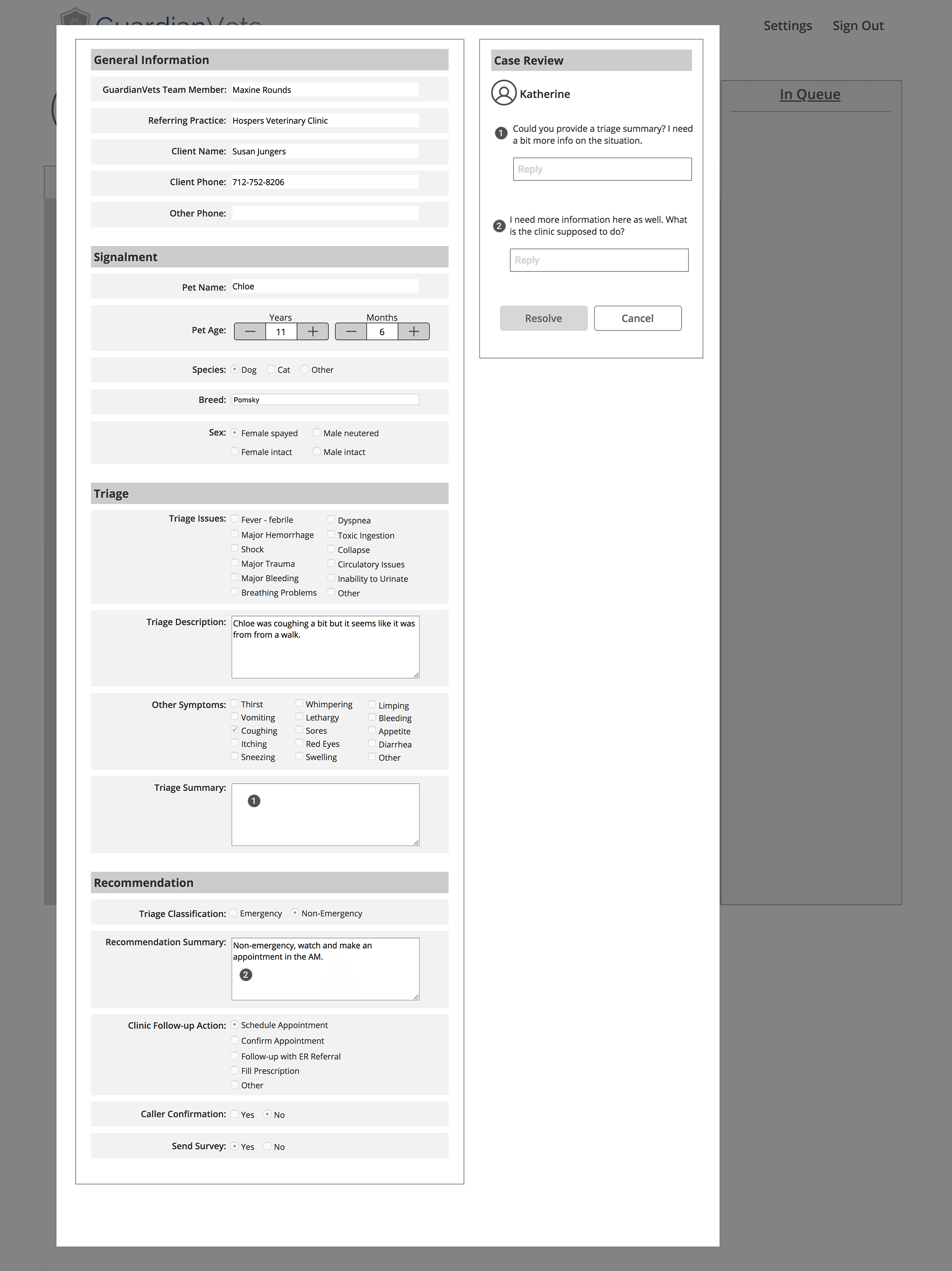
Review Form
![]()
-
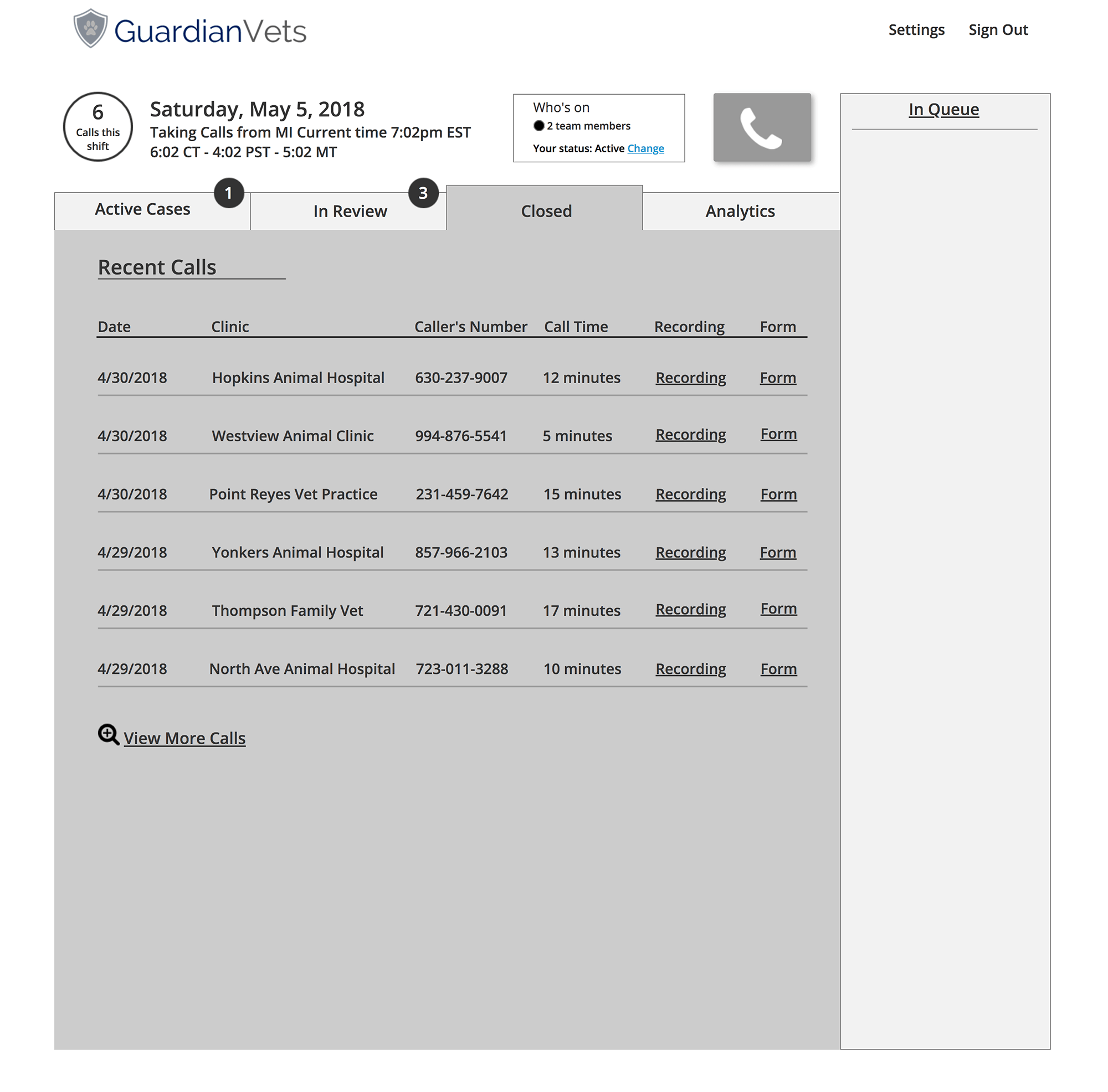
Closed Calls Tab
![]()
-
Analytics Tab
![]()
USABILITY TESTING
After we built the key screens, I unified them into a working prototype. It was now time to test the usability of the prototype with the GuardianVets team. Unfortunately, two of the three users had to cancel, so we also asked the team manager to test the design. This wasn’t ideal, but we gathered some great insights, and we were glad to get the team manager’s perspective, as well.
We heard that the users found the layout and navigation to be intuitive, and the high-level tabs were clear and easy to understand. They understood and desired the functionality, especially the ease of data entry, the ability to return to a form, and the in-system review process.
We also found some areas that needed refinement. Some in-page labelling was unclear, and any metrics referring to a time frame needed to be more specific. For example, it was unclear if “calls last week” meant calls from the last calendar week or the last 7 days.
We also uncovered a significant usability issue that we addressed immediately. In our initial design, the decision support form obscured the dial-out button, but we found that users dialed out most often when they were actually already on a call and needed to contact a vet. As a result, we did a quick redesign of the top of the page, moving the call button to the right column where it would remain visible and active when a user had a form open.
FINAL DESIGN
After making the handful of changes resulting from usability testing, we put together annotated wireframes so our client could move the project forward with a UI or development team. At the final meeting with our client, we presented our prototype, testing results, final designs, and future considerations. He loved what he saw:
“In 3 weeks… not only did they uncover a problem I didn’t see, they re-engineered a core process in a way that will drive a lot of value for us in the future, came up with a design that is intuitive for my team members to use and frankly looks a lot cooler.”
Final Prototype Screens
Annotations
FUTURE CONSIDERATIONS
Given the three-week design sprint, we couldn’t address everything. I put together an inventory of what we thought should come next.
Testing: Given the limited amount of testing we were able to do, we recommend more to validate usability as the system develops.
Unique IDs: Given the limitations of using a telephone number as a unique identifier, we wanted GuardianVets to consider developing an ID system that can reconcile callers using multiple numbers, having multiple pets, or pets having multiple owners.
The form: When building the client-facing section of the system, ensure that the clinics will be able to update their own clinic information. This will be critical as the business scales.
Messaging: Enable the GuardianVets team to communicate within the platform to lessen their reliance on personal devices and accounts, centralize communication records for reference, and allow an opportunity to indicate user status (e.g. online, on a call, on break, offline, etc.)
Protocol: As a more formal triage protocol develops, strive to maintain the balance between building a standardized process and maintaining the highly valued aspect of a person-to-person interaction.
The list of considerations laid out a path to improve the experience for all users through increased analytical flexibility, efficient customization, centralized communication, and a service structure that embraces a core value proposition of the service: human interaction. Nailing this benefits all stakeholders—pet owners, vet clinics, the GuardianVets team, and the business as a whole.
CONCLUSIONS / LESSONS LEARNED
New territory
This was also my first time working on a B2B product. It was a challenge to consider and reconcile the needs and goals of the multiple involved parties: GuardianVets management and staff, vet clinics, and pet owners.
From the jump
In retrospect, we were not completely aligned with our client at the outset around expectations for setting up user interviews, access to the current platform, and the design process in general. Had we firmly established these expectations at the outset, we likely would have saved some scrambling throughout the project.
Make your case
This was my first experience challenging a client’s stated preferences and point of view. Even if it led to a few uncomfortable moments, it was the right decision to advocate for the user and for what our research suggested was best for all stakeholders and for the business as a whole.
Focus on foundation
In defining and scoping our problem, we focused on one we thought would benefit all users—this rationale really resonated with our client. I’ll definitely make it a point to look to focus on core issues that pay system-level dividends.
Having the opportunity to step into users’ ultra-familiar day-to-day experiences was both fascinating and rewarding. It’s fulfilling to think that improvements you can make on a system will pay direct and significant dividends to the people we met. This is exactly the kind of thing that draws me to design and excites me to continue to find opportunities to practice in the future.